SpotHero
SpotHero
SpotHero
SpotHero
Enhancing trust, personalization, and efficiency in parking reservations.
Enhancing trust, personalization, and efficiency in parking reservations.
Enhancing trust, personalization, and efficiency in parking reservations.
Enhancing trust, personalization, and efficiency in parking reservations.


Project overview
Project overview
Project overview
Project overview
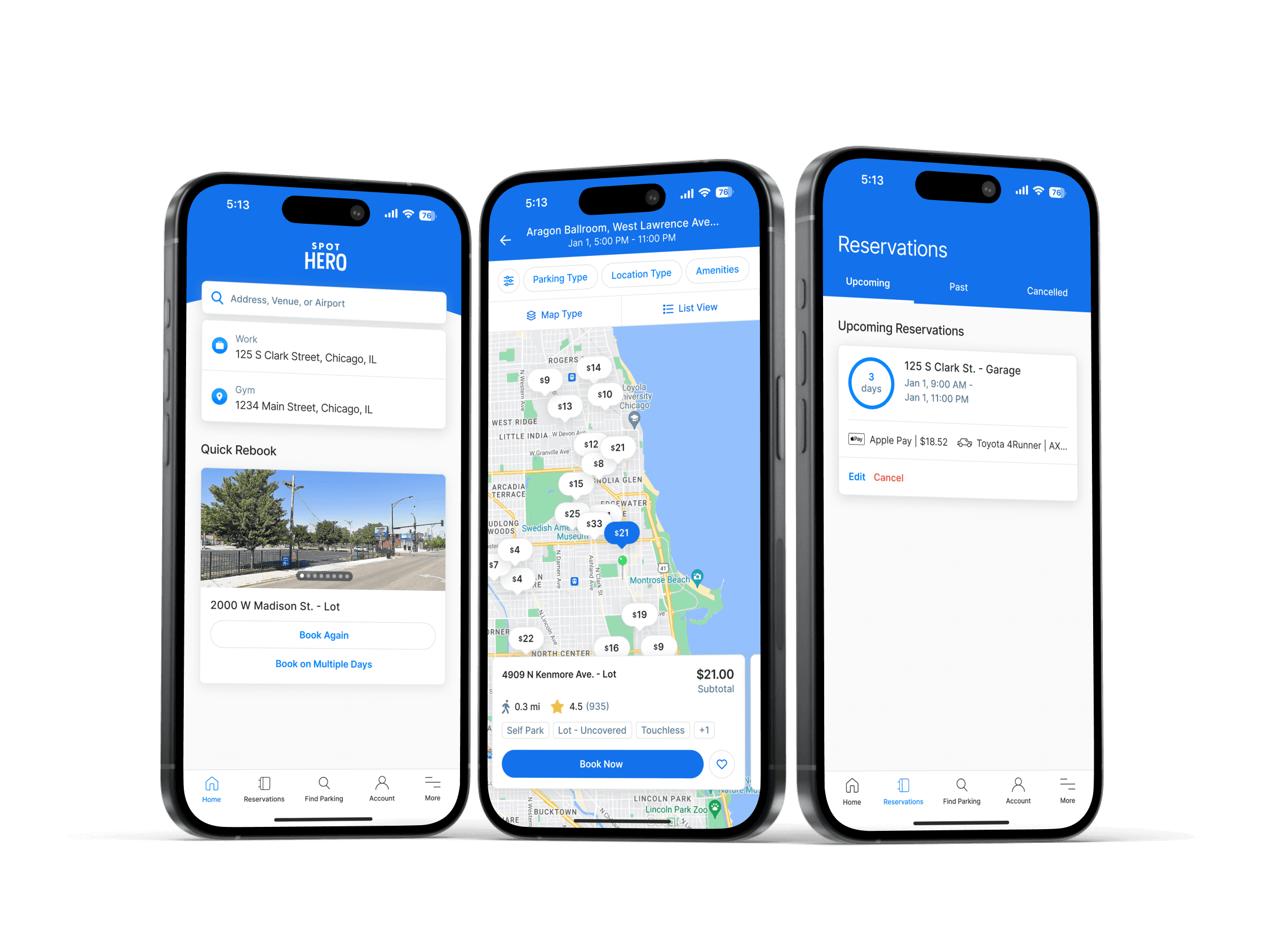
This conceptual redesign explores ways to improve the SpotHero app by enhancing reviews, adding personalized features like saved parking spots, and optimizing the sort and filter interface. The goal was to sharpen my UX skills while identifying practical improvements for a commonly used product.
This conceptual redesign explores ways to improve the SpotHero app by enhancing reviews, adding personalized features like saved parking spots, and optimizing the sort and filter interface. The goal was to sharpen my UX skills while identifying practical improvements for a commonly used product.
This conceptual redesign explores ways to improve the SpotHero app by enhancing reviews, adding personalized features like saved parking spots, and optimizing the sort and filter interface. The goal was to sharpen my UX skills while identifying practical improvements for a commonly used product.
This conceptual redesign explores ways to improve the SpotHero app by enhancing reviews, adding personalized features like saved parking spots, and optimizing the sort and filter interface. The goal was to sharpen my UX skills while identifying practical improvements for a commonly used product.
Timeline
Aug 2022 - Jul 2024
Oct - Nov 2023
Oct - Nov 2023
Oct - Nov 2023
Team
2 Designers, 4 Engineers
1 Product Designer
1 Product Designer
1 Product Designer
Role
Product Designer
Tools
Figma
Platform
Web and mobile app
Status
Shipped and live
Conceptual redesign
Conceptual redesign
Conceptual redesign
Contribution
Primary research, concept ideation, prototyping, high-fidelity designs
UX research, feature audit, interaction design, high-fidelity prototypes
UX research, feature audit, interaction design, high-fidelity prototypes
UX research, feature audit, interaction design, high-fidelity prototypes
Timeline
Oct - Nov 2023
Team
1 Product Designer
Role
Product Designer
Tools
Figma
Platform
Web and mobile app
Status
Conceptual redesign
Contribution
UX research
Feature audit
Interaction design
High-fidelity prototypes
Core challenge
Core challenge
Core challenge
Core challenge
SpotHero provides a reliable way to book parking in busy areas, but several key UX limitations reduce confidence and convenience for users.
SpotHero provides a reliable way to book parking in busy areas, but several key UX limitations reduce confidence and convenience for users.
SpotHero provides a reliable way to book parking in busy areas, but several key UX limitations reduce confidence and convenience for users.
SpotHero provides a reliable way to book parking in busy areas, but several key UX limitations reduce confidence and convenience for users.
Missing reviews
Missing reviews
Missing reviews
Missing reviews
No access to individual reviews lowers trust and makes it harder to compare different options.
No access to individual reviews lowers trust and makes it harder to compare different options.
No access to individual reviews lowers trust and makes it harder to compare different options.
No access to individual reviews lowers trust and makes it harder to compare different options.
No favorites
No favorites
No favorites
No favorites
Users can’t save preferred garages, making repeat bookings slower and less personal.
Users can’t save preferred garages, making repeat bookings slower and less personal.
Users can’t save preferred garages, making repeat bookings slower and less personal.
Users can’t save preferred garages, making repeat bookings slower and less personal.
Clunky search
Clunky search
Clunky search
Clunky search
Disjointed sort and filter options increase friction during time-sensitive parking searches.
Disjointed sort and filter options increase friction during time-sensitive parking searches.
Disjointed sort and filter options increase friction during time-sensitive parking searches.
Disjointed sort and filter options increase friction during time-sensitive parking searches.
Research
Research
Research
Research
I analyzed the app experience through a user lens, mapping out pain points and identifying small UX enhancements that could create outsized impact. I focused on three areas: reviews, saving spots, and sort/filter UI.
I analyzed the app experience through a user lens, mapping out pain points and identifying small UX enhancements that could create outsized impact. I focused on three areas: reviews, saving spots, and sort/filter UI.
I analyzed the app experience through a user lens, mapping out pain points and identifying small UX enhancements that could create outsized impact. I focused on three areas: reviews, saving spots, and sort/filter UI.
I analyzed the app experience through a user lens, mapping out pain points and identifying small UX enhancements that could create outsized impact. I focused on three areas: reviews, saving spots, and sort/filter UI.
Key insights
Key insights
Key insights
Key insights
Users want to read real customer reviews before booking, not just star ratings.
Users returning to the same spots frequently have no easy way to save or favorite them.
Sort/filter options are scattered, increasing friction during time-sensitive parking searches.
Users want to read real customer reviews before booking, not just star ratings.
Users returning to the same spots frequently have no easy way to save or favorite them.
Sort/filter options are scattered, increasing friction during time-sensitive parking searches.
Users want to read real customer reviews before booking, not just star ratings.
Users returning to the same spots frequently have no easy way to save or favorite them.
Sort/filter options are scattered, increasing friction during time-sensitive parking searches.
Users want to read real customer reviews before booking, not just star ratings.
Users returning to the same spots frequently have no easy way to save or favorite them.
Sort/filter options are scattered, increasing friction during time-sensitive parking searches.
Reviews
Reviews
Reviews
Reviews
The original app only shows an average star rating for each spot. My redesign surfaces full customer reviews and breaks them into digestible parts:
The original app only shows an average star rating for each spot. My redesign surfaces full customer reviews and breaks them into digestible parts:
The original app only shows an average star rating for each spot. My redesign surfaces full customer reviews and breaks them into digestible parts:
The original app only shows an average star rating for each spot. My redesign surfaces full customer reviews and breaks them into digestible parts:
Review title
Star rating
Date
Reviewer name
Written feedback
Review title
Star rating
Date
Reviewer name
Written feedback
Review title
Star rating
Date
Reviewer name
Written feedback
Review title
Star rating
Date
Reviewer name
Written feedback
Before
Before
Before
Before
Users saw an average rating but no details about other people's experiences.
Users saw an average rating but no details about other people's experiences.
Users saw an average rating but no details about other people's experiences.
Users saw an average rating but no details about other people's experiences.


After
After
After
After
Full transparency builds trust, helping users avoid poorly rated spots and book with confidence.
Full transparency builds trust, helping users avoid poorly rated spots and book with confidence.
Full transparency builds trust, helping users avoid poorly rated spots and book with confidence.
Full transparency builds trust, helping users avoid poorly rated spots and book with confidence.


Additionally, I added a summary bar showing the count of each star rating (1–5) and included a clear CTA to add a review.
Additionally, I added a summary bar showing the count of each star rating (1–5) and included a clear CTA to add a review.
Additionally, I added a summary bar showing the count of each star rating (1–5) and included a clear CTA to add a review.
Additionally, I added a summary bar showing the count of each star rating (1–5) and included a clear CTA to add a review.


By adding these components, I've created a comprehensive review section for the spot details page. This aims to provide users with valuable insights into each parking spot, help them weigh the pros and cons, and make more informed decisions. Ultimately, this should result in fewer dissatisfied customers.
By adding these components, I've created a comprehensive review section for the spot details page. This aims to provide users with valuable insights into each parking spot, help them weigh the pros and cons, and make more informed decisions. Ultimately, this should result in fewer dissatisfied customers.
By adding these components, I've created a comprehensive review section for the spot details page. This aims to provide users with valuable insights into each parking spot, help them weigh the pros and cons, and make more informed decisions. Ultimately, this should result in fewer dissatisfied customers.
By adding these components, I've created a comprehensive review section for the spot details page. This aims to provide users with valuable insights into each parking spot, help them weigh the pros and cons, and make more informed decisions. Ultimately, this should result in fewer dissatisfied customers.


Saved parking spots
Saved parking spots
Saved parking spots
Saved parking spots
As mentioned earlier, users currently cannot save or favorite individual parking spots. However, they can save frequently used addresses. On mobile, these saved places are located within the user's settings.
As mentioned earlier, users currently cannot save or favorite individual parking spots. However, they can save frequently used addresses. On mobile, these saved places are located within the user's settings.
As mentioned earlier, users currently cannot save or favorite individual parking spots. However, they can save frequently used addresses. On mobile, these saved places are located within the user's settings.
As mentioned earlier, users currently cannot save or favorite individual parking spots. However, they can save frequently used addresses. On mobile, these saved places are located within the user's settings.


For saving parking spots, I determined the best place to incorporate this feature is directly on the individual parking spot card. A button allowing users to save spots can be positioned next to the existing "Book Now" button, making this a subtle yet useful addition.
For saving parking spots, I determined the best place to incorporate this feature is directly on the individual parking spot card. A button allowing users to save spots can be positioned next to the existing "Book Now" button, making this a subtle yet useful addition.
For saving parking spots, I determined the best place to incorporate this feature is directly on the individual parking spot card. A button allowing users to save spots can be positioned next to the existing "Book Now" button, making this a subtle yet useful addition.
For saving parking spots, I determined the best place to incorporate this feature is directly on the individual parking spot card. A button allowing users to save spots can be positioned next to the existing "Book Now" button, making this a subtle yet useful addition.
Here's what saving a parking spot now looks like in action:
Here's what saving a parking spot now looks like in action:
Here's what saving a parking spot now looks like in action:
Here's what saving a parking spot now looks like in action:


Original (no favorite button)
Original (no favorite button)
Original (no favorite button)
Original (no favorite button)
New (with favorite button)
New (with favorite button)
New (with favorite button)
New (with favorite button)
Before
Before
Before
Before
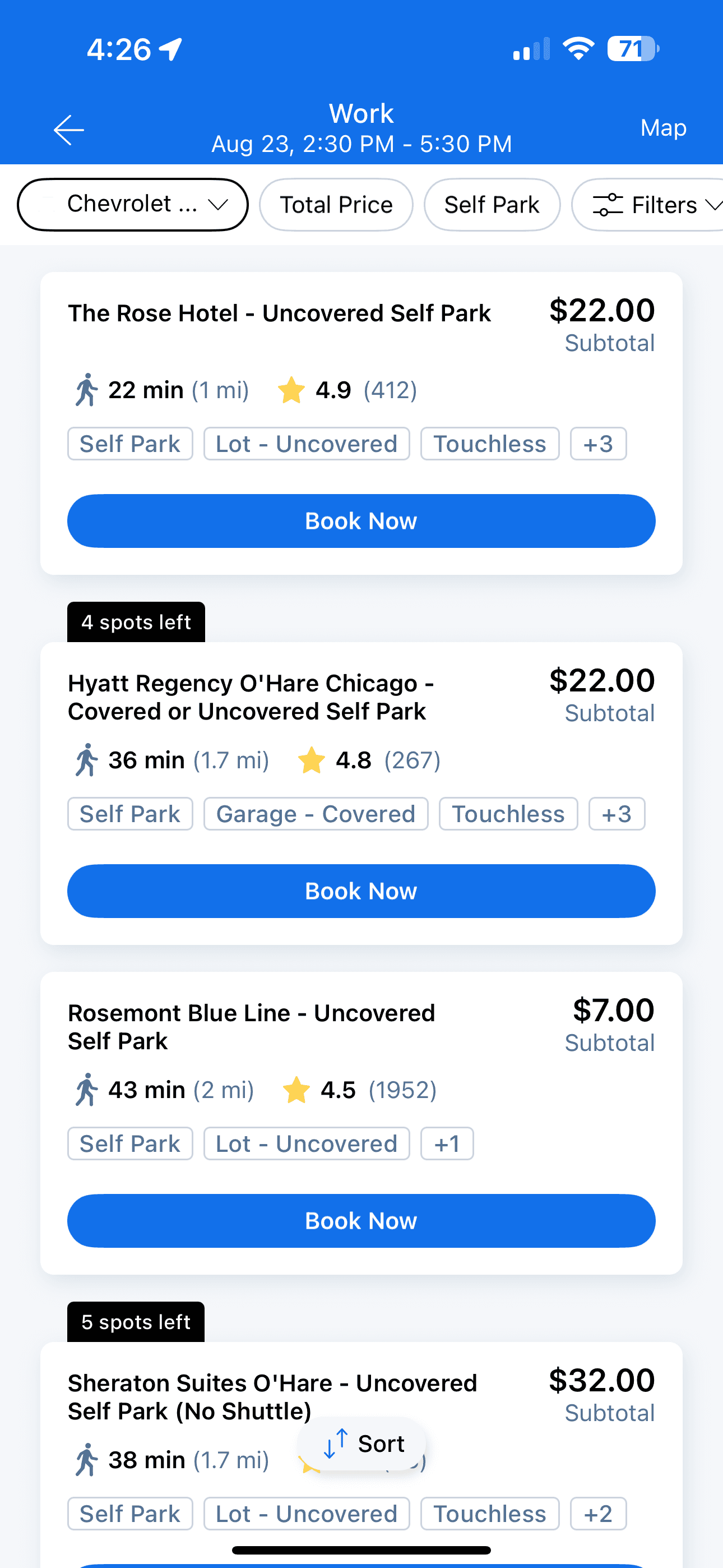
Previously, users couldn't save individual parking spots to their favorites. While this feature isn't absolutely essential, it would be a nice quality-of-life improvement for both desktop and mobile users.
Previously, users couldn't save individual parking spots to their favorites. While this feature isn't absolutely essential, it would be a nice quality-of-life improvement for both desktop and mobile users.
Previously, users couldn't save individual parking spots to their favorites. While this feature isn't absolutely essential, it would be a nice quality-of-life improvement for both desktop and mobile users.
Previously, users couldn't save individual parking spots to their favorites. While this feature isn't absolutely essential, it would be a nice quality-of-life improvement for both desktop and mobile users.
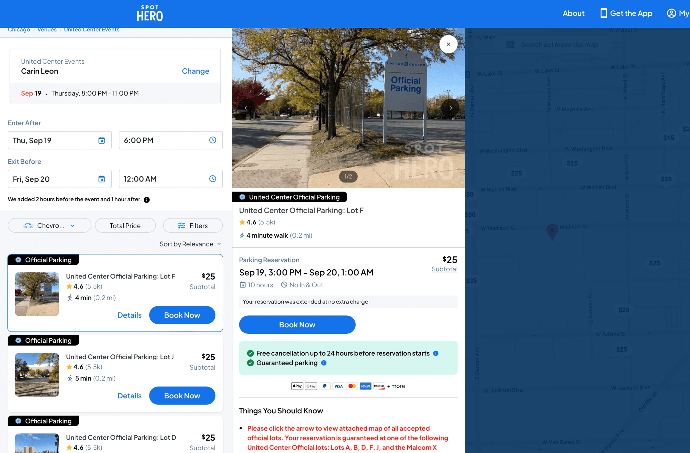




After
After
After
After
Users can now easily save frequently visited parking spots with a simple click. The feature is subtly integrated so it doesn't significantly alter the parking spot card's structure, yet remains visible and easily accessible.
Users can now easily save frequently visited parking spots with a simple click. The feature is subtly integrated so it doesn't significantly alter the parking spot card's structure, yet remains visible and easily accessible.
Users can now easily save frequently visited parking spots with a simple click. The feature is subtly integrated so it doesn't significantly alter the parking spot card's structure, yet remains visible and easily accessible.
Users can now easily save frequently visited parking spots with a simple click. The feature is subtly integrated so it doesn't significantly alter the parking spot card's structure, yet remains visible and easily accessible.
It’s also crucial to provide a dedicated space for these newly saved spots. I chose to rename the "Saved Places" label in account settings to "Saved Locations." This tab now allows users to toggle between "Saved Places" (addresses) and "Saved Spots" (individual parking spots), consolidating all saved locations in one place.
It’s also crucial to provide a dedicated space for these newly saved spots. I chose to rename the "Saved Places" label in account settings to "Saved Locations." This tab now allows users to toggle between "Saved Places" (addresses) and "Saved Spots" (individual parking spots), consolidating all saved locations in one place.
It’s also crucial to provide a dedicated space for these newly saved spots. I chose to rename the "Saved Places" label in account settings to "Saved Locations." This tab now allows users to toggle between "Saved Places" (addresses) and "Saved Spots" (individual parking spots), consolidating all saved locations in one place.
It’s also crucial to provide a dedicated space for these newly saved spots. I chose to rename the "Saved Places" label in account settings to "Saved Locations." This tab now allows users to toggle between "Saved Places" (addresses) and "Saved Spots" (individual parking spots), consolidating all saved locations in one place.


Sort & filter options
Sort & filter options
Sort & filter options
Sort & filter options
The SpotHero app currently offers several interactive options on the Find Parking page, including quick access to the self-park filter, all filters, map/list view, and sort functions.
The SpotHero app currently offers several interactive options on the Find Parking page, including quick access to the self-park filter, all filters, map/list view, and sort functions.
The SpotHero app currently offers several interactive options on the Find Parking page, including quick access to the self-park filter, all filters, map/list view, and sort functions.
The SpotHero app currently offers several interactive options on the Find Parking page, including quick access to the self-park filter, all filters, map/list view, and sort functions.
Self Park: Allows users to filter search results to show only self-parking options.
Filters: Provides access to a range of filtering options to refine search results.
Map/List View: Lets users switch between a map view and a list view of parking spots.
Sort: Enables users to organize search results based on criteria such as price or distance.
I noticed that the sort button was positioned differently from the other interactive options on the page. Additionally, the map/list view buttons could be made more prominent.
I noticed that the sort button was positioned differently from the other interactive options on the page. Additionally, the map/list view buttons could be made more prominent.
I noticed that the sort button was positioned differently from the other interactive options on the page. Additionally, the map/list view buttons could be made more prominent.
I noticed that the sort button was positioned differently from the other interactive options on the page. Additionally, the map/list view buttons could be made more prominent.


To address this, I designed a new component to be placed at the top of the Find Parking page. This new layout features a top row dedicated to frequently used filter options like parking type, location type, and amenities. Users can access additional filters by clicking the filters icon on the left.
To address this, I designed a new component to be placed at the top of the Find Parking page. This new layout features a top row dedicated to frequently used filter options like parking type, location type, and amenities. Users can access additional filters by clicking the filters icon on the left.
To address this, I designed a new component to be placed at the top of the Find Parking page. This new layout features a top row dedicated to frequently used filter options like parking type, location type, and amenities. Users can access additional filters by clicking the filters icon on the left.
To address this, I designed a new component to be placed at the top of the Find Parking page. This new layout features a top row dedicated to frequently used filter options like parking type, location type, and amenities. Users can access additional filters by clicking the filters icon on the left.
Below the filters, I've enhanced the sort functionality. In list view, users can sort results or switch to map view. In map view, users can choose different map types or return to list view.
Below the filters, I've enhanced the sort functionality. In list view, users can sort results or switch to map view. In map view, users can choose different map types or return to list view.
Below the filters, I've enhanced the sort functionality. In list view, users can sort results or switch to map view. In map view, users can choose different map types or return to list view.
Below the filters, I've enhanced the sort functionality. In list view, users can sort results or switch to map view. In map view, users can choose different map types or return to list view.


List view
List view
List view
List view


Map view
Map view

By moving the sort options to the same area as the filter and map/list view selections, all user actions are now consolidated in one location.
By moving the sort options to the same area as the filter and map/list view selections, all user actions are now consolidated in one location.
By moving the sort options to the same area as the filter and map/list view selections, all user actions are now consolidated in one location.
By moving the sort options to the same area as the filter and map/list view selections, all user actions are now consolidated in one location.
Here's how this updated design looks in action:
Here's how this updated design looks in action:
Here's how this updated design looks in action:
Here's how this updated design looks in action:


Final takeaways
Final takeaways
Final takeaways
Final takeaways
This redesign focused on small, targeted improvements that could create meaningful impact for real users. If continued, future explorations could include:
This redesign focused on small, targeted improvements that could create meaningful impact for real users. If continued, future explorations could include:
This redesign focused on small, targeted improvements that could create meaningful impact for real users. If continued, future explorations could include:
This redesign focused on small, targeted improvements that could create meaningful impact for real users. If continued, future explorations could include:
Map view upgrades (satellite, dark mode)
Price range sliders for budget-conscious users
In-app customer support enhancements
Map view upgrades (satellite, dark mode)
Price range sliders for budget-conscious users
In-app customer support enhancements
Map view upgrades (satellite, dark mode)
Price range sliders for budget-conscious users
In-app customer support enhancements
Map view upgrades (satellite, dark mode)
Price range sliders for budget-conscious users
In-app customer support enhancements
Working within the existing framework pushed me to think critically about UI placement, constraints, and user habits — skills that transfer to real-world product design challenges.
Working within the existing framework pushed me to think critically about UI placement, constraints, and user habits — skills that transfer to real-world product design challenges.
Working within the existing framework pushed me to think critically about UI placement, constraints, and user habits — skills that transfer to real-world product design challenges.
Working within the existing framework pushed me to think critically about UI placement, constraints, and user habits — skills that transfer to real-world product design challenges.
Disclaimer: This is a conceptual, unsolicited redesign. I am not affiliated with SpotHero, and all opinions are my own.
Disclaimer: This is a conceptual, unsolicited redesign. I am not affiliated with SpotHero, and all opinions are my own.
Disclaimer: This is a conceptual, unsolicited redesign. I am not affiliated with SpotHero, and all opinions are my own.
Disclaimer: This is a conceptual, unsolicited redesign. I am not affiliated with SpotHero, and all opinions are my own.


