

Homeseeker
Homeseeker
Homeseeker
Homeseeker
A platform for discovering and saving your dream home listings.
A platform for discovering and saving your dream home listings.
A platform for discovering and saving your dream home listings.
A platform for discovering and saving your dream home listings.

Project overview
Project overview
Project overview
Project overview
This independent student project was created during the Google UX Design Certificate Program. I led the end-to-end design process, including research, wireframing, prototyping, and branding.
This independent student project was created during the Google UX Design Certificate Program. I led the end-to-end design process, including research, wireframing, prototyping, and branding.
This independent student project was created during the Google UX Design Certificate Program. I led the end-to-end design process, including research, wireframing, prototyping, and branding.
This independent student project was created during the Google UX Design Certificate Program. I led the end-to-end design process, including research, wireframing, prototyping, and branding.
Timeline
Aug 2022 - Jul 2024
Mar - Apr 2022
Mar - Apr 2022
Mar - Apr 2022
Team
2 Designers, 4 Engineers
1 Product Designer
1 Product Designer
1 Product Designer
Role
Product Designer
Tools
Figma
Platform
Web and mobile app
Web (desktop-first)
Web (desktop-first)
Web (desktop-first)
Status
Shipped and live
Course project
Course project
Course project
Contribution
Primary research, concept ideation, prototyping, high-fidelity designs
User research, sitemap planning, high-fidelity designs, usability testing, UI design
User research, sitemap planning, high-fidelity designs, usability testing, UI design
User research, sitemap planning, high-fidelity designs, usability testing, UI design
Timeline
Mar - Apr 2022
Team
1 Product Designer
Role
Product Designer
Tools
Figma
Platform
Web (desktop-first)
Status
Course project
Contribution
User research
Sitemap planning
High-fidelity designs
Usability testing
UI design
Core challenge
Core challenge
Core challenge
Core challenge
Finding a home is often overwhelming and time-consuming. Users need a clearer, more customizable way to browse listings, compare details, and feel confident in their decisions.
Finding a home is often overwhelming and time-consuming. Users need a clearer, more customizable way to browse listings, compare details, and feel confident in their decisions.
Finding a home is often overwhelming and time-consuming. Users need a clearer, more customizable way to browse listings, compare details, and feel confident in their decisions.
Finding a home is often overwhelming and time-consuming. Users need a clearer, more customizable way to browse listings, compare details, and feel confident in their decisions.
Understanding the user
Understanding the user
Understanding the user
Understanding the user
I started my research by analyzing data taken from user surveys. This helped me learn what struggles people face when searching for their ideal home and what some of their most common pain points are.
I started my research by analyzing data taken from user surveys. This helped me learn what struggles people face when searching for their ideal home and what some of their most common pain points are.
I started my research by analyzing data taken from user surveys. This helped me learn what struggles people face when searching for their ideal home and what some of their most common pain points are.
I started my research by analyzing data taken from user surveys. This helped me learn what struggles people face when searching for their ideal home and what some of their most common pain points are.
Key insights
Key insights
Key insights
Key insights
Through surveys and early discovery research, I uncovered the following pain points:
Through surveys and early discovery research, I uncovered the following pain points:
Through surveys and early discovery research, I uncovered the following pain points:
Through surveys and early discovery research, I uncovered the following pain points:
Users want more information about a home’s atmosphere and surroundings
Hidden fees and unclear availability create frustration
Users need stronger filter controls to narrow down listings by cost, location, and amenities
Users want more information about a home’s atmosphere and surroundings
Hidden fees and unclear availability create frustration
Users need stronger filter controls to narrow down listings by cost, location, and amenities
Users want more information about a home’s atmosphere and surroundings
Hidden fees and unclear availability create frustration
Users need stronger filter controls to narrow down listings by cost, location, and amenities
Users want more information about a home’s atmosphere and surroundings
Hidden fees and unclear availability create frustration
Users need stronger filter controls to narrow down listings by cost, location, and amenities

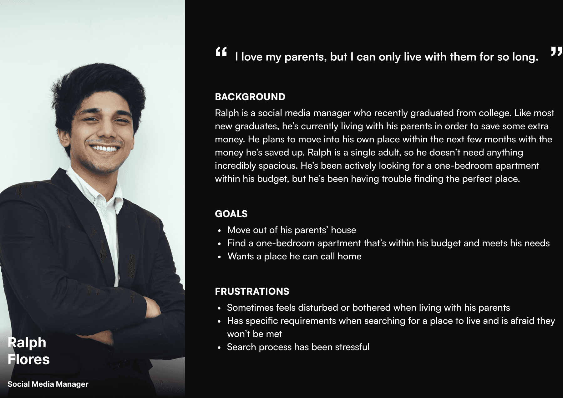
Defining the user
Defining the user
Defining the user
Defining the user
I created a persona based on research insights to guide the design process. This helped ensure the platform met the expectations of real people looking for homes tailored to their needs.
I created a persona based on research insights to guide the design process. This helped ensure the platform met the expectations of real people looking for homes tailored to their needs.
I created a persona based on research insights to guide the design process. This helped ensure the platform met the expectations of real people looking for homes tailored to their needs.
I created a persona based on research insights to guide the design process. This helped ensure the platform met the expectations of real people looking for homes tailored to their needs.
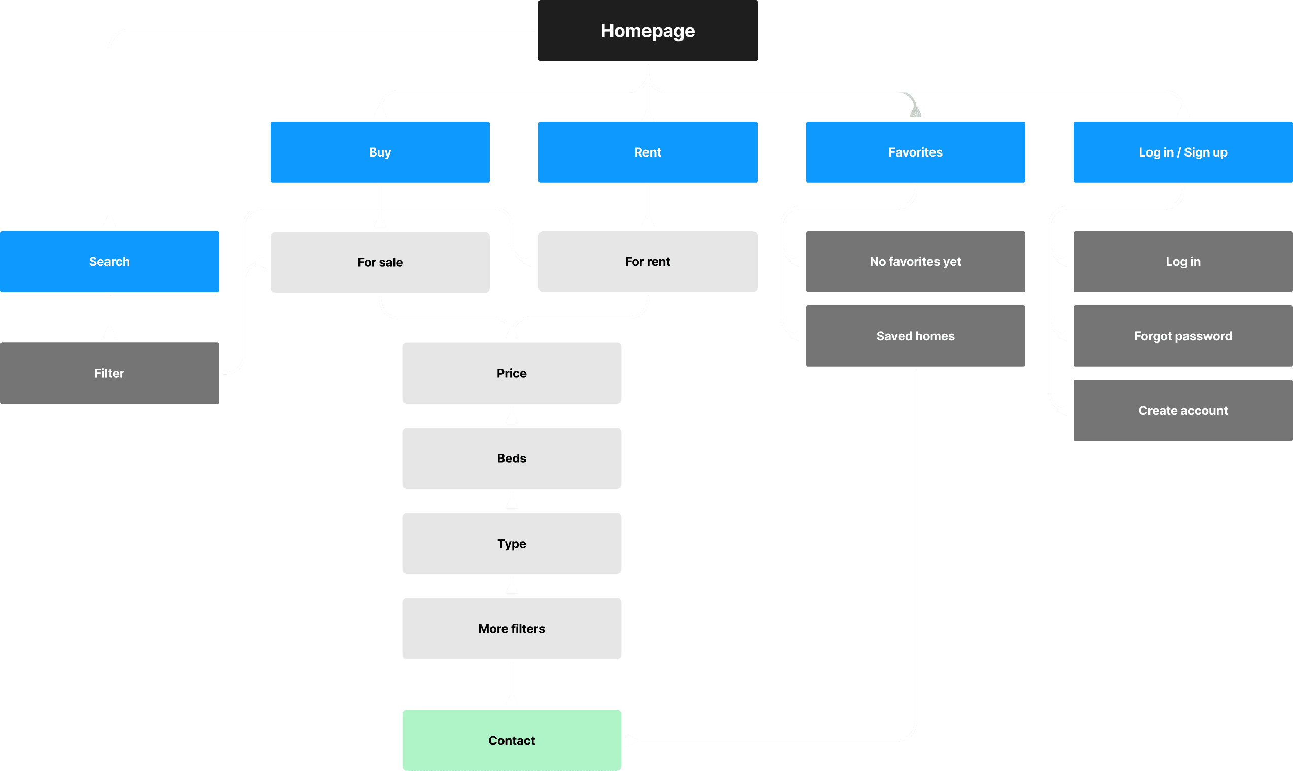
Structure & flow
Structure & flow
Structure & flow
Structure & flow
Given the task-oriented nature of home searching, I prioritized a desktop experience over mobile. I created a sitemap to define the main user flow from search to saved listings.
Given the task-oriented nature of home searching, I prioritized a desktop experience over mobile. I created a sitemap to define the main user flow from search to saved listings.
Given the task-oriented nature of home searching, I prioritized a desktop experience over mobile. I created a sitemap to define the main user flow from search to saved listings.
Given the task-oriented nature of home searching, I prioritized a desktop experience over mobile. I created a sitemap to define the main user flow from search to saved listings.
Low-fidelity prototype
Low-fidelity prototype
Low-fidelity prototype
Low-fidelity prototype
Once the structure was defined, I created a clickable low-fidelity prototype to test the interaction flow.
Once the structure was defined, I created a clickable low-fidelity prototype to test the interaction flow.
Once the structure was defined, I created a clickable low-fidelity prototype to test the interaction flow.
Once the structure was defined, I created a clickable low-fidelity prototype to test the interaction flow.


Usability testing
Usability testing
Usability testing
Usability testing
I conducted an unmoderated usability study with five participants. Key feedback led to the following improvements:
I conducted an unmoderated usability study with five participants. Key feedback led to the following improvements:
I conducted an unmoderated usability study with five participants. Key feedback led to the following improvements:
I conducted an unmoderated usability study with five participants. Key feedback led to the following improvements:
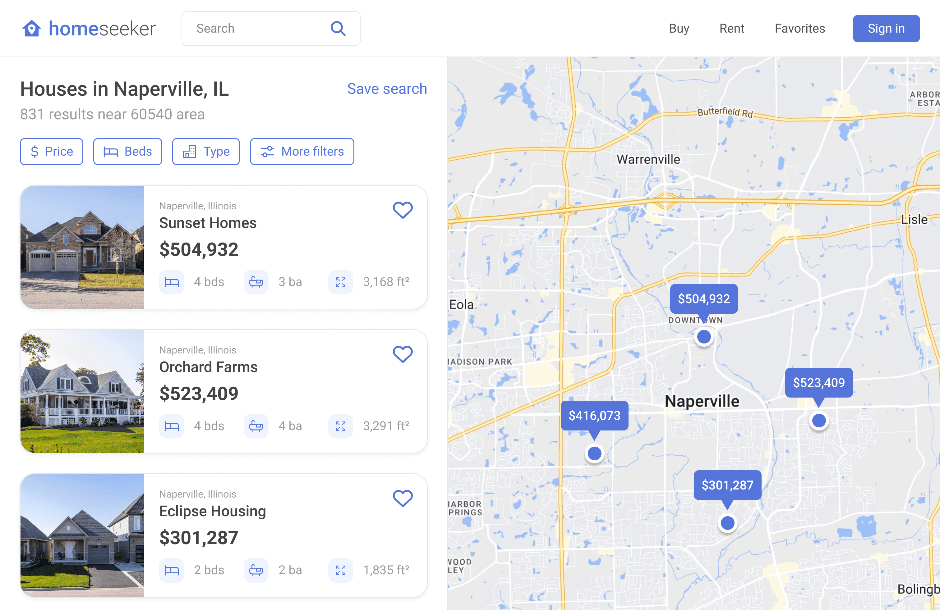
Added clarity to filter categories
Shortened listing descriptions to reduce information overload
Displayed listing location relative to map
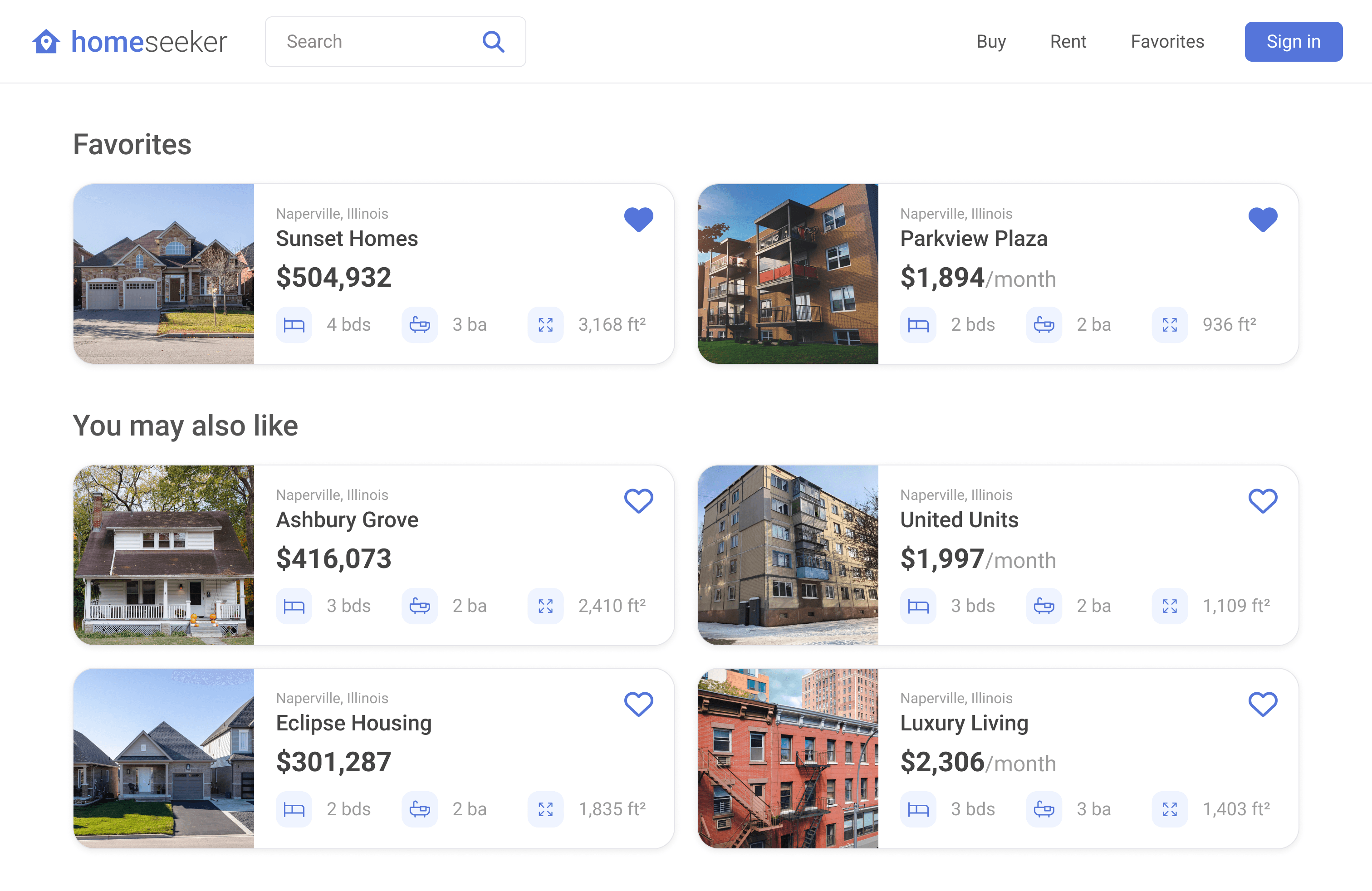
Introduced a recommended listings section for guided discovery
Added clarity to filter categories
Shortened listing descriptions to reduce information overload
Displayed listing location relative to map
Introduced a recommended listings section for guided discovery
Added clarity to filter categories
Shortened listing descriptions to reduce information overload
Displayed listing location relative to map
Introduced a recommended listings section for guided discovery
Added clarity to filter categories
Shortened listing descriptions to reduce information overload
Displayed listing location relative to map
Introduced a recommended listings section for guided discovery
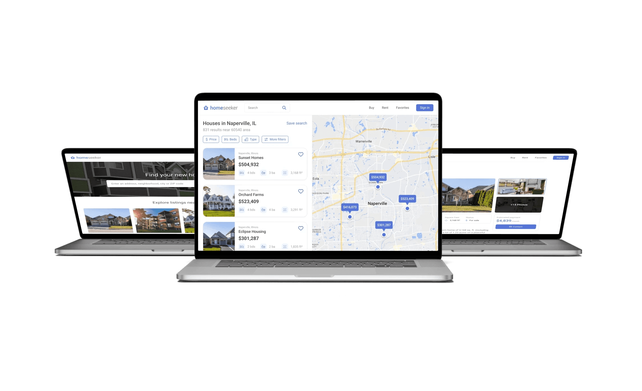
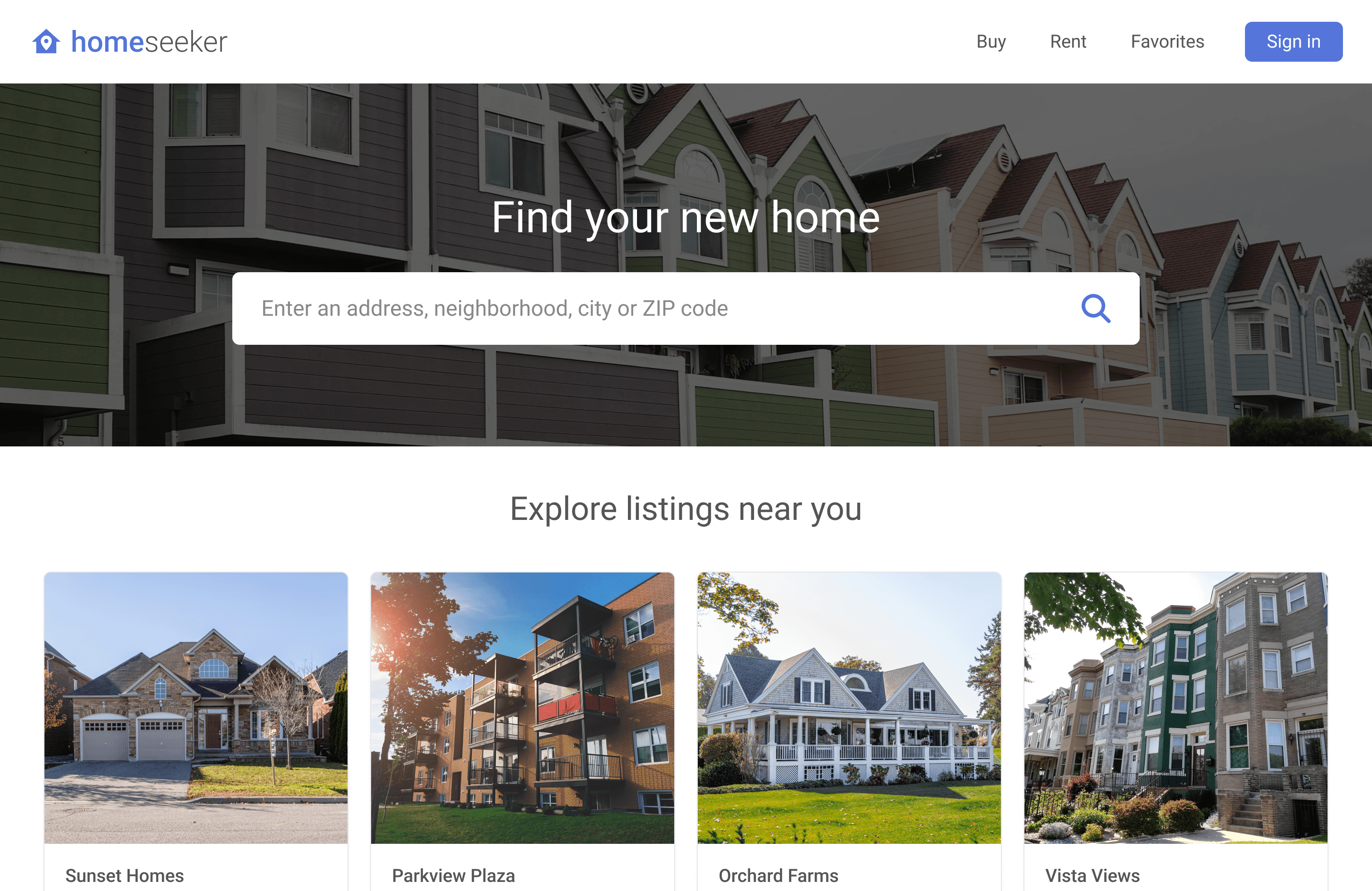
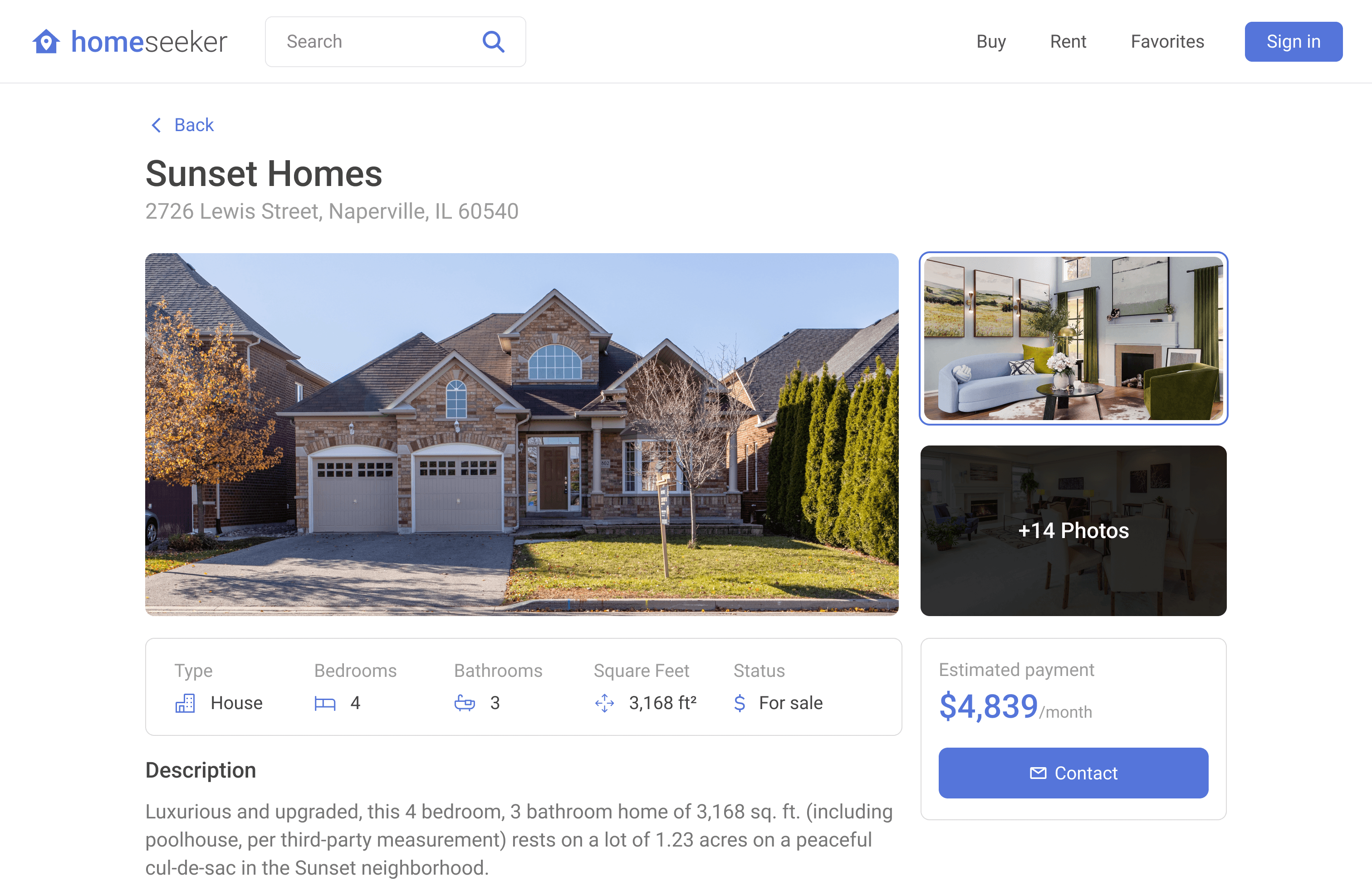
Final design
Final design
Final design
Final design
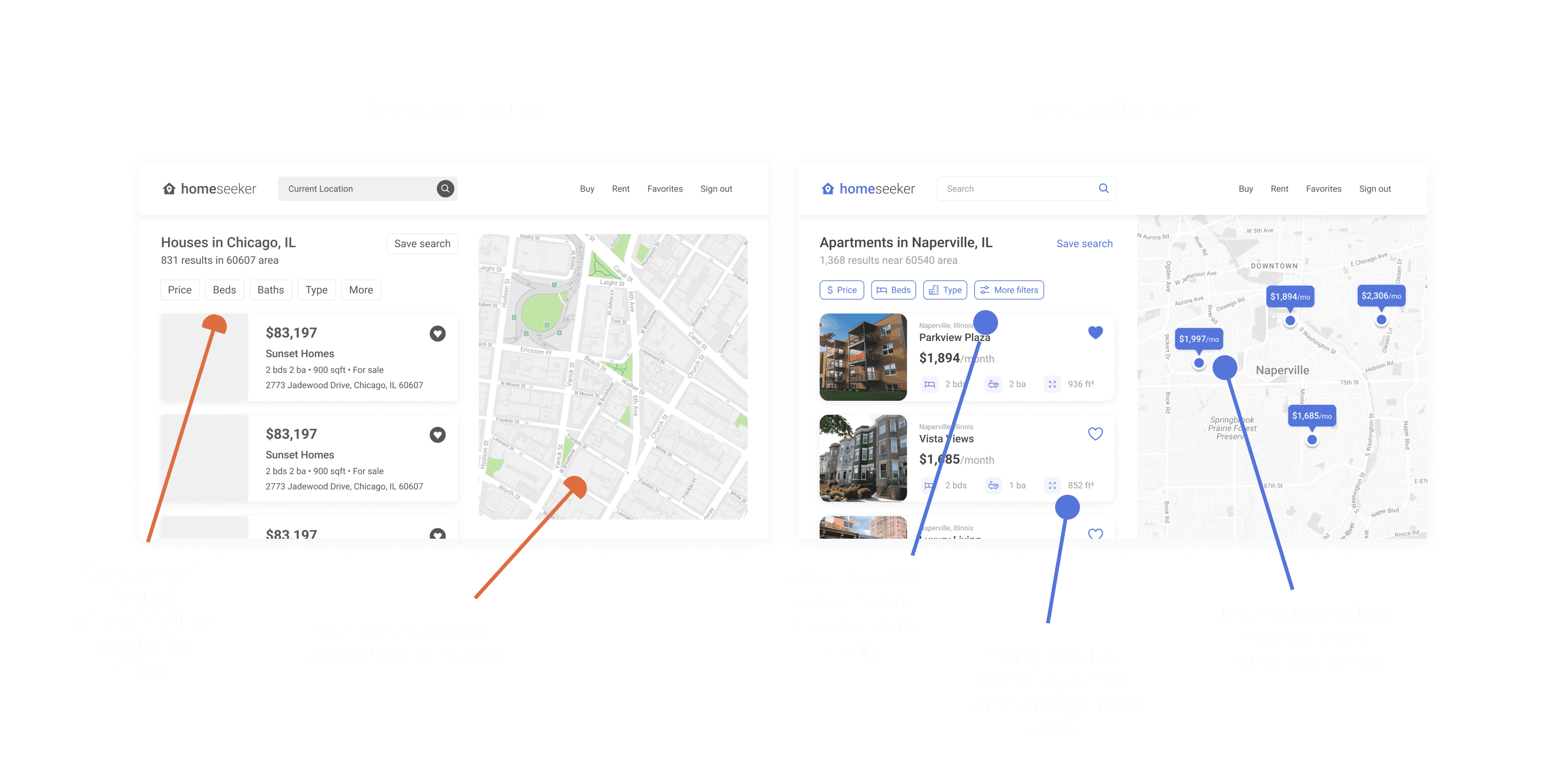
The final interface is clean and minimal, built to reduce cognitive load during a high-stress decision-making process. Filters, maps, and listing details are clearly presented for ease of use.
The final interface is clean and minimal, built to reduce cognitive load during a high-stress decision-making process. Filters, maps, and listing details are clearly presented for ease of use.
The final interface is clean and minimal, built to reduce cognitive load during a high-stress decision-making process. Filters, maps, and listing details are clearly presented for ease of use.
The final interface is clean and minimal, built to reduce cognitive load during a high-stress decision-making process. Filters, maps, and listing details are clearly presented for ease of use.
Final takeaways
Final takeaways
Final takeaways
Final takeaways
This project gave me experience designing for desktop-first web apps and deepened my understanding of the home-search experience. Here’s what I would improve if continued:
This project gave me experience designing for desktop-first web apps and deepened my understanding of the home-search experience. Here’s what I would improve if continued:
This project gave me experience designing for desktop-first web apps and deepened my understanding of the home-search experience. Here’s what I would improve if continued:
This project gave me experience designing for desktop-first web apps and deepened my understanding of the home-search experience. Here’s what I would improve if continued:
Expanded filters: More control under "More Filters" would let users customize searches even further
Saved searches: Allow users to name and revisit search criteria
Differentiation: Homeseeker could benefit from a stronger niche or unique value proposition to stand out in a crowded market
Expanded filters: More control under "More Filters" would let users customize searches even further
Saved searches: Allow users to name and revisit search criteria
Differentiation: Homeseeker could benefit from a stronger niche or unique value proposition to stand out in a crowded market
Expanded filters: More control under "More Filters" would let users customize searches even further
Saved searches: Allow users to name and revisit search criteria
Differentiation: Homeseeker could benefit from a stronger niche or unique value proposition to stand out in a crowded market
Expanded filters: More control under "More Filters" would let users customize searches even further
Saved searches: Allow users to name and revisit search criteria
Differentiation: Homeseeker could benefit from a stronger niche or unique value proposition to stand out in a crowded market
Next steps
Next steps
Next steps
Next steps
Explore a mobile app version of Homeseeker
Conduct additional rounds of user testing
Iterate on unique features that set Homeseeker apart
Explore a mobile app version of Homeseeker
Conduct additional rounds of user testing
Iterate on unique features that set Homeseeker apart
Explore a mobile app version of Homeseeker
Conduct additional rounds of user testing
Iterate on unique features that set Homeseeker apart
Explore a mobile app version of Homeseeker
Conduct additional rounds of user testing
Iterate on unique features that set Homeseeker apart