


CamoAg
CamoAg
CamoAg
CamoAg
A single platform for managing land, portfolios, and agricultural data.
A single platform for managing land, portfolios, and agricultural data.
A single platform for managing land, portfolios, and agricultural data.
A single platform for managing land, portfolios, and agricultural data.
Project overview
Project overview
Project overview
Project overview
This case study explores a unified digital platform that integrates land, portfolio, and agricultural data. By streamlining workflows and accelerating data analysis, the platform aims to boost operational efficiency and empower faster decision-making.
This case study explores a unified digital platform that integrates land, portfolio, and agricultural data. By streamlining workflows and accelerating data analysis, the platform aims to boost operational efficiency and empower faster decision-making.
This case study explores a unified digital platform that integrates land, portfolio, and agricultural data. By streamlining workflows and accelerating data analysis, the platform aims to boost operational efficiency and empower faster decision-making.
This case study explores a unified digital platform that integrates land, portfolio, and agricultural data. By streamlining workflows and accelerating data analysis, the platform aims to boost operational efficiency and empower faster decision-making.
Timeline
Aug 2022 - Jul 2024
Team
2 Designers, 4 Engineers
Role
Product Designer
Tools
Figma
Platform
Web and mobile app
Status
Shipped and live
Contribution
Primary research, concept ideation, prototyping, high-fidelity designs
Timeline
Aug 2022 - Jul 2024
Team
2 Designers, 4 Engineers
Role
Product Designer
Tools
Figma
Platform
Web and mobile app
Status
Shipped and live
Contribution
Primary research
Concept ideation
Prototyping
High-fidelity designs
Core challenge
Core challenge
Core challenge
Core challenge
Agricultural professionals rely on manual processes, outdated platforms, and complex land management tools, causing workflow inefficiencies and slow decision-making.
Agricultural professionals rely on manual processes, outdated platforms, and complex land management tools, causing workflow inefficiencies and slow decision-making.
Agricultural professionals rely on manual processes, outdated platforms, and complex land management tools, causing workflow inefficiencies and slow decision-making.
Agricultural professionals rely on manual processes, outdated platforms, and complex land management tools, causing workflow inefficiencies and slow decision-making.
60%
60%
60%
60%
Users had difficulty finding specific farmland data quickly.
Users had difficulty finding specific farmland data quickly.
Users had difficulty finding specific farmland data quickly.
Users had difficulty finding specific farmland data quickly.
45%
45%
45%
45%
Farmland managers struggled to oversee large land portfolios.
Farmland managers struggled to oversee large land portfolios.
Farmland managers struggled to oversee large land portfolios.
Farmland managers struggled to oversee large land portfolios.
30%
30%
30%
30%
Users confused by onboarding, dropped off at higher rates.
Users confused by onboarding, dropped off at higher rates.
Users confused by onboarding, dropped off at higher rates.
Users confused by onboarding, dropped off at higher rates.
Business impact
Business impact
Business impact
Business impact
Understanding the business impact of these challenges helped shape design decisions.
Understanding the business impact of these challenges helped shape design decisions.
Understanding the business impact of these challenges helped shape design decisions.
Understanding the business impact of these challenges helped shape design decisions.
Inefficient workflows → Increased operational costs and lower user engagement
Limited search functionality → Reduced efficiency in farmland evaluation
Confusing onboarding → Hindered paid conversions and expansions
Inefficient workflows → Increased operational costs and lower user engagement
Limited search functionality → Reduced efficiency in farmland evaluation
Confusing onboarding → Hindered paid conversions and expansions
Inefficient workflows → Increased operational costs and lower user engagement
Limited search functionality → Reduced efficiency in farmland evaluation
Confusing onboarding → Hindered paid conversions and expansions
Inefficient workflows → Increased operational costs and lower user engagement
Limited search functionality → Reduced efficiency in farmland evaluation
Confusing onboarding → Hindered paid conversions and expansions
Research
Research
Research
Research
To validate the problem, we conducted user interviews, internal surveys, and competitive analysis, focusing on growth and user retention challenges in agricultural technology.
To validate the problem, we conducted user interviews, internal surveys, and competitive analysis, focusing on growth and user retention challenges in agricultural technology.
To validate the problem, we conducted user interviews, internal surveys, and competitive analysis, focusing on growth and user retention challenges in agricultural technology.
To validate the problem, we conducted user interviews, internal surveys, and competitive analysis, focusing on growth and user retention challenges in agricultural technology.
Key findings
Key findings
Key findings
Key findings
From the survey and interviews, we gathered three key insights during the discovery process.
From the survey and interviews, we gathered three key insights during the discovery process.
From the survey and interviews, we gathered three key insights during the discovery process.
From the survey and interviews, we gathered three key insights during the discovery process.
Users desire faster, more direct access to core functions.
Users with large portfolios require more intuitive tools for farm oversight.
Users need more powerful and precise search and filtering controls.
Users desire faster, more direct access to core functions.
Users with large portfolios require more intuitive tools for farm oversight.
Users need more powerful and precise search and filtering controls.
Users desire faster, more direct access to core functions.
Users with large portfolios require more intuitive tools for farm oversight.
Users need more powerful and precise search and filtering controls.
Users desire faster, more direct access to core functions.
Users with large portfolios require more intuitive tools for farm oversight.
Users need more powerful and precise search and filtering controls.
Defining the user
Defining the user
Defining the user
Defining the user
To start, we identified three key user groups: generic users, lending institutions, and farmland managers. Understanding their goals and overlapping needs was crucial for designing tailored solutions for each.
To start, we identified three key user groups: generic users, lending institutions, and farmland managers. Understanding their goals and overlapping needs was crucial for designing tailored solutions for each.
To start, we identified three key user groups: generic users, lending institutions, and farmland managers. Understanding their goals and overlapping needs was crucial for designing tailored solutions for each.
To start, we identified three key user groups: generic users, lending institutions, and farmland managers. Understanding their goals and overlapping needs was crucial for designing tailored solutions for each.

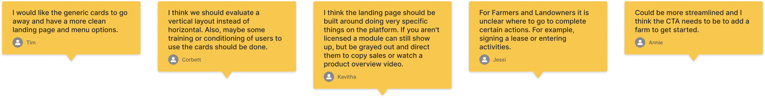
Internal surveys
Internal surveys
Internal surveys
Internal surveys
To better understand what to include on the landing page, we conducted a series of surveys. The objective was to gather insights on what would be most effective for our users. We applied this same process to the farms dashboard and search refinement on the map.
To better understand what to include on the landing page, we conducted a series of surveys. The objective was to gather insights on what would be most effective for our users. We applied this same process to the farms dashboard and search refinement on the map.
To better understand what to include on the landing page, we conducted a series of surveys. The objective was to gather insights on what would be most effective for our users. We applied this same process to the farms dashboard and search refinement on the map.
To better understand what to include on the landing page, we conducted a series of surveys. The objective was to gather insights on what would be most effective for our users. We applied this same process to the farms dashboard and search refinement on the map.
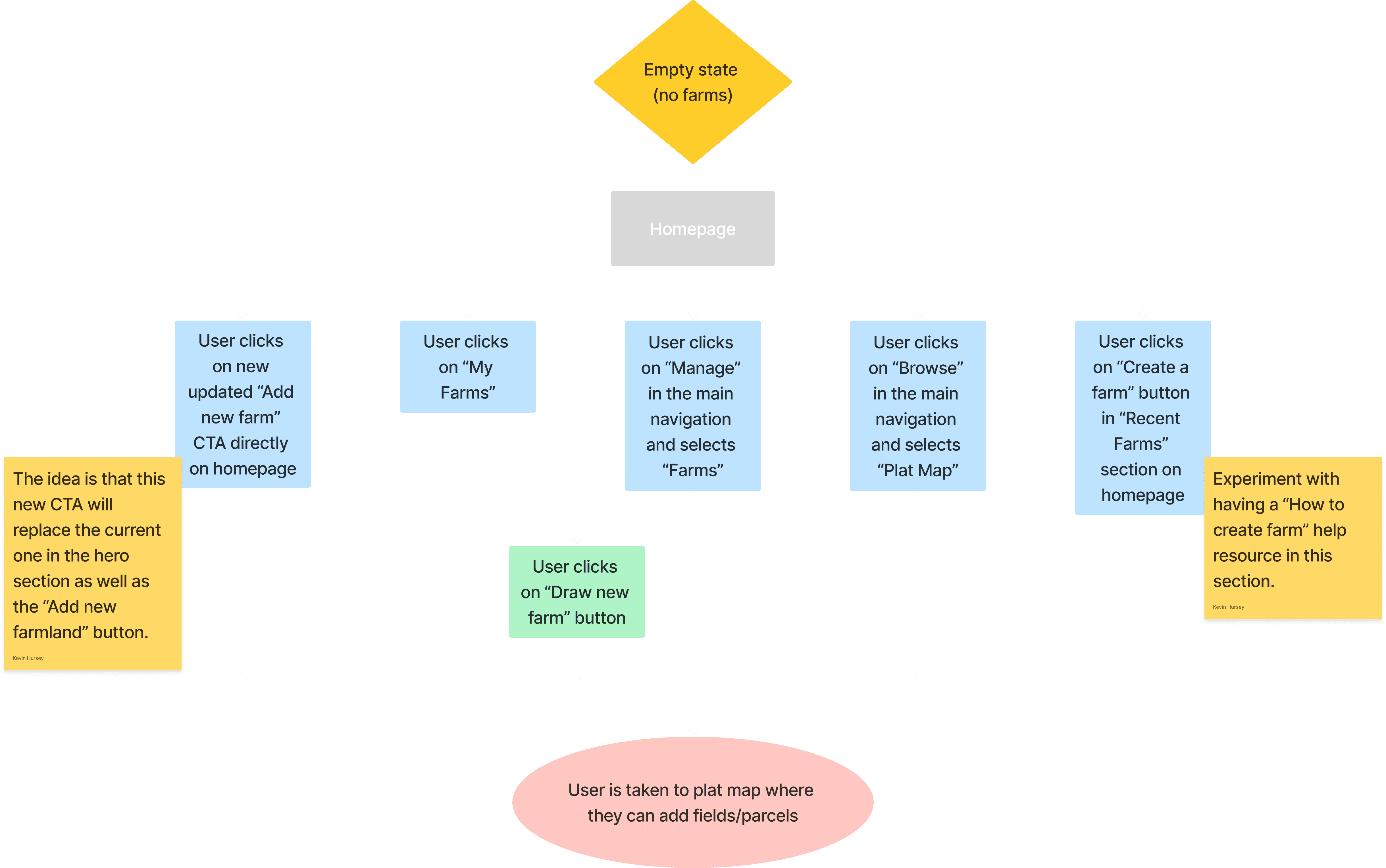
Sitemap
Sitemap
Sitemap
Sitemap
The next step was to define the main user flow of the product. Given that some users visit the platform to perform very specific tasks, it's crucial to ensure they can achieve their goals as smoothly and efficiently as possible.
The next step was to define the main user flow of the product. Given that some users visit the platform to perform very specific tasks, it's crucial to ensure they can achieve their goals as smoothly and efficiently as possible.
The next step was to define the main user flow of the product. Given that some users visit the platform to perform very specific tasks, it's crucial to ensure they can achieve their goals as smoothly and efficiently as possible.
The next step was to define the main user flow of the product. Given that some users visit the platform to perform very specific tasks, it's crucial to ensure they can achieve their goals as smoothly and efficiently as possible.
Card sorting
Card sorting
Card sorting
Card sorting
Feedback from internal stakeholders and external customers revealed a specific list of items that users wanted to be able to search for on the platform. The challenge then was to organize this content in a way that wouldn't overwhelm the user with too many options.
Feedback from internal stakeholders and external customers revealed a specific list of items that users wanted to be able to search for on the platform. The challenge then was to organize this content in a way that wouldn't overwhelm the user with too many options.
Feedback from internal stakeholders and external customers revealed a specific list of items that users wanted to be able to search for on the platform. The challenge then was to organize this content in a way that wouldn't overwhelm the user with too many options.
Feedback from internal stakeholders and external customers revealed a specific list of items that users wanted to be able to search for on the platform. The challenge then was to organize this content in a way that wouldn't overwhelm the user with too many options.

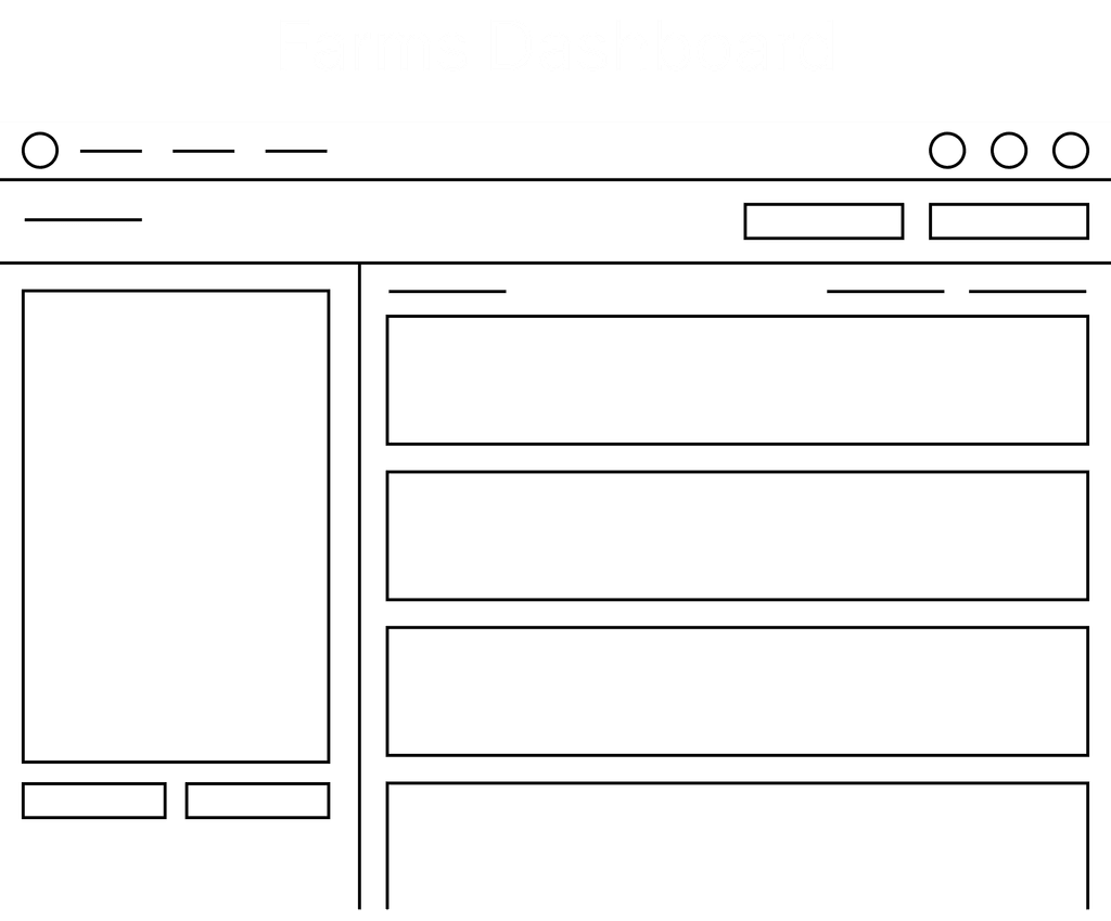
Sketches
Sketches
Sketches
Sketches
With the general structure now established, I began sketching out ideas. Each category underwent several stages of this process, with the final layouts for each displayed below.
With the general structure now established, I began sketching out ideas. Each category underwent several stages of this process, with the final layouts for each displayed below.
With the general structure now established, I began sketching out ideas. Each category underwent several stages of this process, with the final layouts for each displayed below.
With the general structure now established, I began sketching out ideas. Each category underwent several stages of this process, with the final layouts for each displayed below.


Design components
Design components
Design components
Design components
We developed and incorporated several design components into our library for these projects. I worked closely with our lead designer to ensure that each component adhered to our brand guidelines and effectively met user needs.
We developed and incorporated several design components into our library for these projects. I worked closely with our lead designer to ensure that each component adhered to our brand guidelines and effectively met user needs.
We developed and incorporated several design components into our library for these projects. I worked closely with our lead designer to ensure that each component adhered to our brand guidelines and effectively met user needs.
We developed and incorporated several design components into our library for these projects. I worked closely with our lead designer to ensure that each component adhered to our brand guidelines and effectively met user needs.
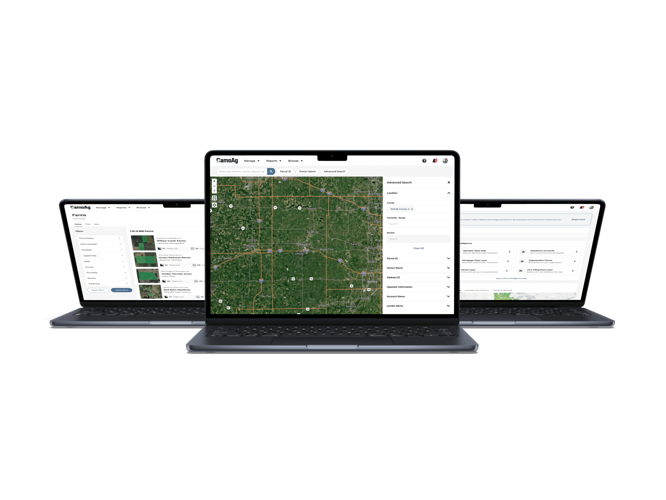
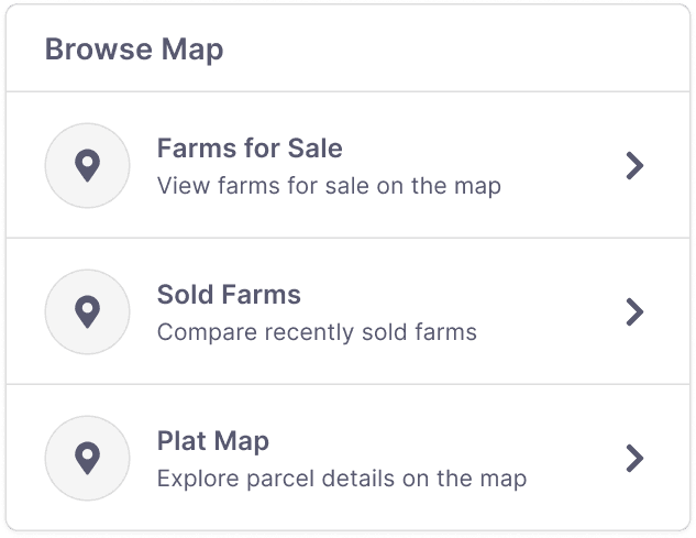
Browse Map: This component allows users to view current farms for sale, compare recently sold farms, and explore parcel details on the plat map.
Browse Map: This component allows users to view current farms for sale, compare recently sold farms, and explore parcel details on the plat map.
Browse Map: This component allows users to view current farms for sale, compare recently sold farms, and explore parcel details on the plat map.
Browse Map: This component allows users to view current farms for sale, compare recently sold farms, and explore parcel details on the plat map.
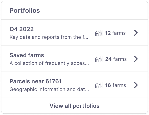
Portfolios: Portfolios serve as a way for users to organize and store similar farms. Users can rename and reorder items within their portfolios to suit their preferences, enhancing farm organization.
Portfolios: Portfolios serve as a way for users to organize and store similar farms. Users can rename and reorder items within their portfolios to suit their preferences, enhancing farm organization.
Portfolios: Portfolios serve as a way for users to organize and store similar farms. Users can rename and reorder items within their portfolios to suit their preferences, enhancing farm organization.
Portfolios: Portfolios serve as a way for users to organize and store similar farms. Users can rename and reorder items within their portfolios to suit their preferences, enhancing farm organization.
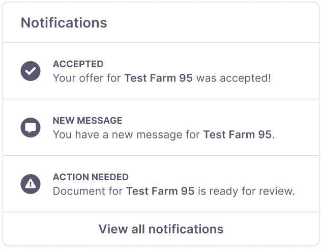
Notifications: All user notifications are housed here, including new messages, offer acceptances and lease documents that require review.
Notifications: All user notifications are housed here, including new messages, offer acceptances and lease documents that require review.
Notifications: All user notifications are housed here, including new messages, offer acceptances and lease documents that require review.
Notifications: All user notifications are housed here, including new messages, offer acceptances and lease documents that require review.
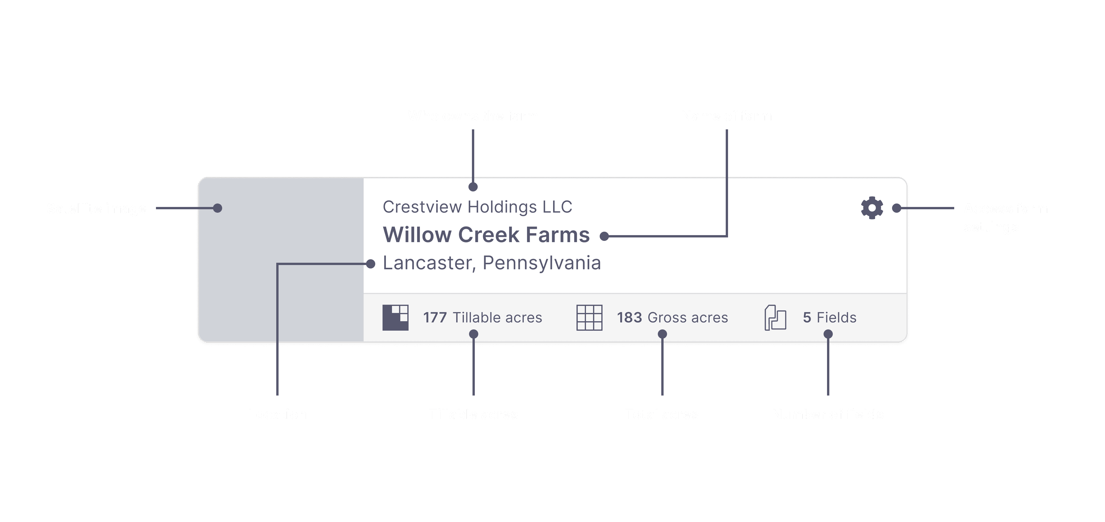
Farm Card: This component has been updated to align with the new farms dashboard. It features details such as a satellite image of the farm, the farm name, legal entity, location, tillable and gross acres, and the number of fields.
Farm Card: This component has been updated to align with the new farms dashboard. It features details such as a satellite image of the farm, the farm name, legal entity, location, tillable and gross acres, and the number of fields.
Farm Card: This component has been updated to align with the new farms dashboard. It features details such as a satellite image of the farm, the farm name, legal entity, location, tillable and gross acres, and the number of fields.
Farm Card: This component has been updated to align with the new farms dashboard. It features details such as a satellite image of the farm, the farm name, legal entity, location, tillable and gross acres, and the number of fields.
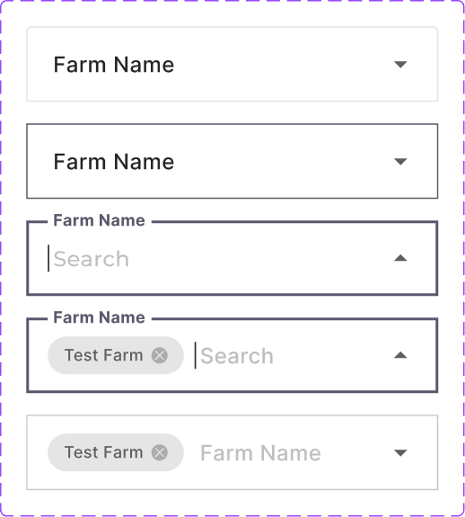
Inputs: Our input component has been updated globally to support various search criteria. Users can now search by state, county, section, township, or range. As they type, autocomplete suggestions appear, allowing them to select from the listed options.
Inputs: Our input component has been updated globally to support various search criteria. Users can now search by state, county, section, township, or range. As they type, autocomplete suggestions appear, allowing them to select from the listed options.
Inputs: Our input component has been updated globally to support various search criteria. Users can now search by state, county, section, township, or range. As they type, autocomplete suggestions appear, allowing them to select from the listed options.
Inputs: Our input component has been updated globally to support various search criteria. Users can now search by state, county, section, township, or range. As they type, autocomplete suggestions appear, allowing them to select from the listed options.
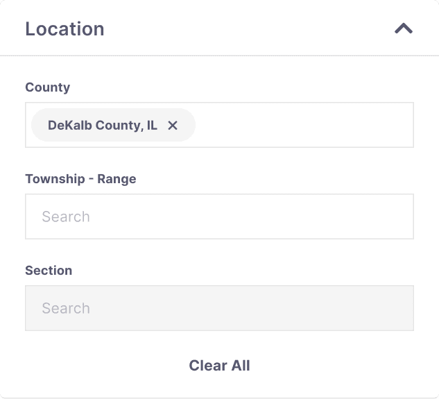
Accordions: These are groups of nested inputs. For instance, the location accordion below includes inputs for county, township-range, and section, along with a 'clear all' button. Accordions can be expanded or collapsed to reveal or hide information.
Accordions: These are groups of nested inputs. For instance, the location accordion below includes inputs for county, township-range, and section, along with a 'clear all' button. Accordions can be expanded or collapsed to reveal or hide information.
Accordions: These are groups of nested inputs. For instance, the location accordion below includes inputs for county, township-range, and section, along with a 'clear all' button. Accordions can be expanded or collapsed to reveal or hide information.
Accordions: These are groups of nested inputs. For instance, the location accordion below includes inputs for county, township-range, and section, along with a 'clear all' button. Accordions can be expanded or collapsed to reveal or hide information.
Landing page
Landing page
Landing page
Landing page
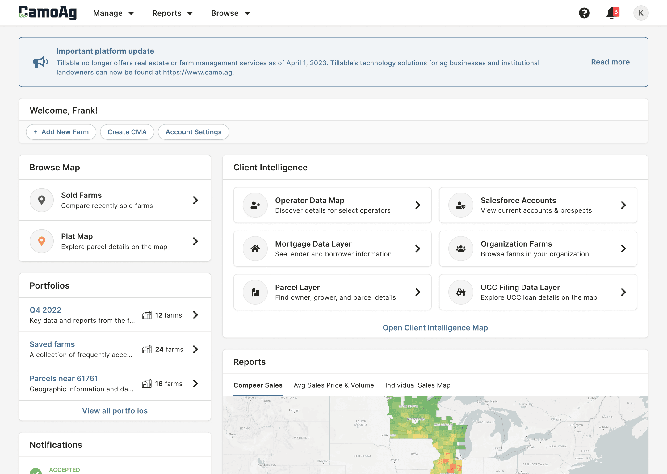
Using the components mentioned above, along with some new ones, we created the following dynamic landing page. Each landing page adapts to the user type detected at log-in. For instance, a lending institution user might have access to reports, while a generic user may not.
Using the components mentioned above, along with some new ones, we created the following dynamic landing page. Each landing page adapts to the user type detected at log-in. For instance, a lending institution user might have access to reports, while a generic user may not.
Using the components mentioned above, along with some new ones, we created the following dynamic landing page. Each landing page adapts to the user type detected at log-in. For instance, a lending institution user might have access to reports, while a generic user may not.
Using the components mentioned above, along with some new ones, we created the following dynamic landing page. Each landing page adapts to the user type detected at log-in. For instance, a lending institution user might have access to reports, while a generic user may not.
Here’s a breakdown of the components featured below:
Here’s a breakdown of the components featured below:
Here’s a breakdown of the components featured below:
Here’s a breakdown of the components featured below:
Platform Announcement Banner: Added at the top of the page to highlight important updates.
Welcome Component: Quick links to actions like adding a new farm or accessing settings.
Client Intelligence Card: Features jump-to links for quickly opening the relevant map.
Reports Card: Visually displays the volume of sales and average sales price on a map.
Farms dashboard
Farms dashboard
Farms dashboard
Farms dashboard
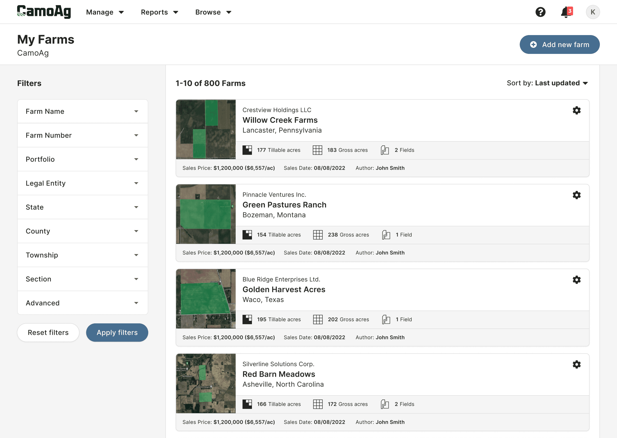
A new dashboard was created to help users manage large volumes of farms more efficiently. From this page, users can toggle between viewing farms, comparative market analyses, and sales.
A new dashboard was created to help users manage large volumes of farms more efficiently. From this page, users can toggle between viewing farms, comparative market analyses, and sales.
A new dashboard was created to help users manage large volumes of farms more efficiently. From this page, users can toggle between viewing farms, comparative market analyses, and sales.
A new dashboard was created to help users manage large volumes of farms more efficiently. From this page, users can toggle between viewing farms, comparative market analyses, and sales.
Here are some of the key updates:
Here are some of the key updates:
Here are some of the key updates:
Here are some of the key updates:
Filter Accordions: Users can now search by farm name, state, county, and more.
Bulk Actions Button: Allows users to edit and update multiple farms simultaneously.
View Options: Users can toggle between card, table, or map views.
Sorting Options: Sort by parameters such as last updated or date created.
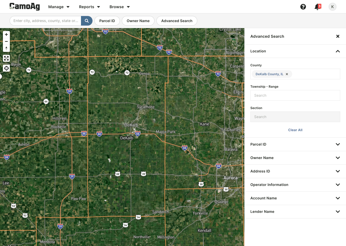
Advanced map search
Advanced map search
Advanced map search
Advanced map search
The advanced search panel was redesigned to give users better control over their searches.
The advanced search panel was redesigned to give users better control over their searches.
The advanced search panel was redesigned to give users better control over their searches.
The advanced search panel was redesigned to give users better control over their searches.
Here’s what’s new:
Here’s what’s new:
Here’s what’s new:
Here’s what’s new:
Location Search: Users can search by county, township-range, and section.
Dynamic Map Zoom: The map automatically zooms in on the relevant area for easier navigation.
Default Location Centering: The map will automatically center on the user's default county.
Location Search: Users can search by county, township-range, and section.
Dynamic Map Zoom: The map automatically zooms in on the relevant area for easier navigation.
Default Location Centering: The map will automatically center on the user's default county.
Location Search: Users can search by county, township-range, and section.
Dynamic Map Zoom: The map automatically zooms in on the relevant area for easier navigation.
Default Location Centering: The map will automatically center on the user's default county.
Location Search: Users can search by county, township-range, and section.
Dynamic Map Zoom: The map automatically zooms in on the relevant area for easier navigation.
Default Location Centering: The map will automatically center on the user's default county.
Final takeaways
Final takeaways
Final takeaways
Final takeaways
During these projects, I gained insight into the common challenges faced by farmers and others in agriculture. I collaborated with various company stakeholders, spoke directly with customers, and designed practical solutions to address these issues.
During these projects, I gained insight into the common challenges faced by farmers and others in agriculture. I collaborated with various company stakeholders, spoke directly with customers, and designed practical solutions to address these issues.
During these projects, I gained insight into the common challenges faced by farmers and others in agriculture. I collaborated with various company stakeholders, spoke directly with customers, and designed practical solutions to address these issues.
During these projects, I gained insight into the common challenges faced by farmers and others in agriculture. I collaborated with various company stakeholders, spoke directly with customers, and designed practical solutions to address these issues.
Additionally, I contributed to a design library at the company, enhancing my understanding of collaboration and balancing feedback during weekly review sessions. Whether through large or small contributions, I had the opportunity to help advance digital solutions in the agriculture sector.
Additionally, I contributed to a design library at the company, enhancing my understanding of collaboration and balancing feedback during weekly review sessions. Whether through large or small contributions, I had the opportunity to help advance digital solutions in the agriculture sector.
Additionally, I contributed to a design library at the company, enhancing my understanding of collaboration and balancing feedback during weekly review sessions. Whether through large or small contributions, I had the opportunity to help advance digital solutions in the agriculture sector.
Additionally, I contributed to a design library at the company, enhancing my understanding of collaboration and balancing feedback during weekly review sessions. Whether through large or small contributions, I had the opportunity to help advance digital solutions in the agriculture sector.

