Back
COURSE PROJECT
A playful new alternative for kids to learn
BRAND
Brightminds
ROLE
UX Designer
EXPERTISE
UX/UI Design
DURATION
Apr - May 2022
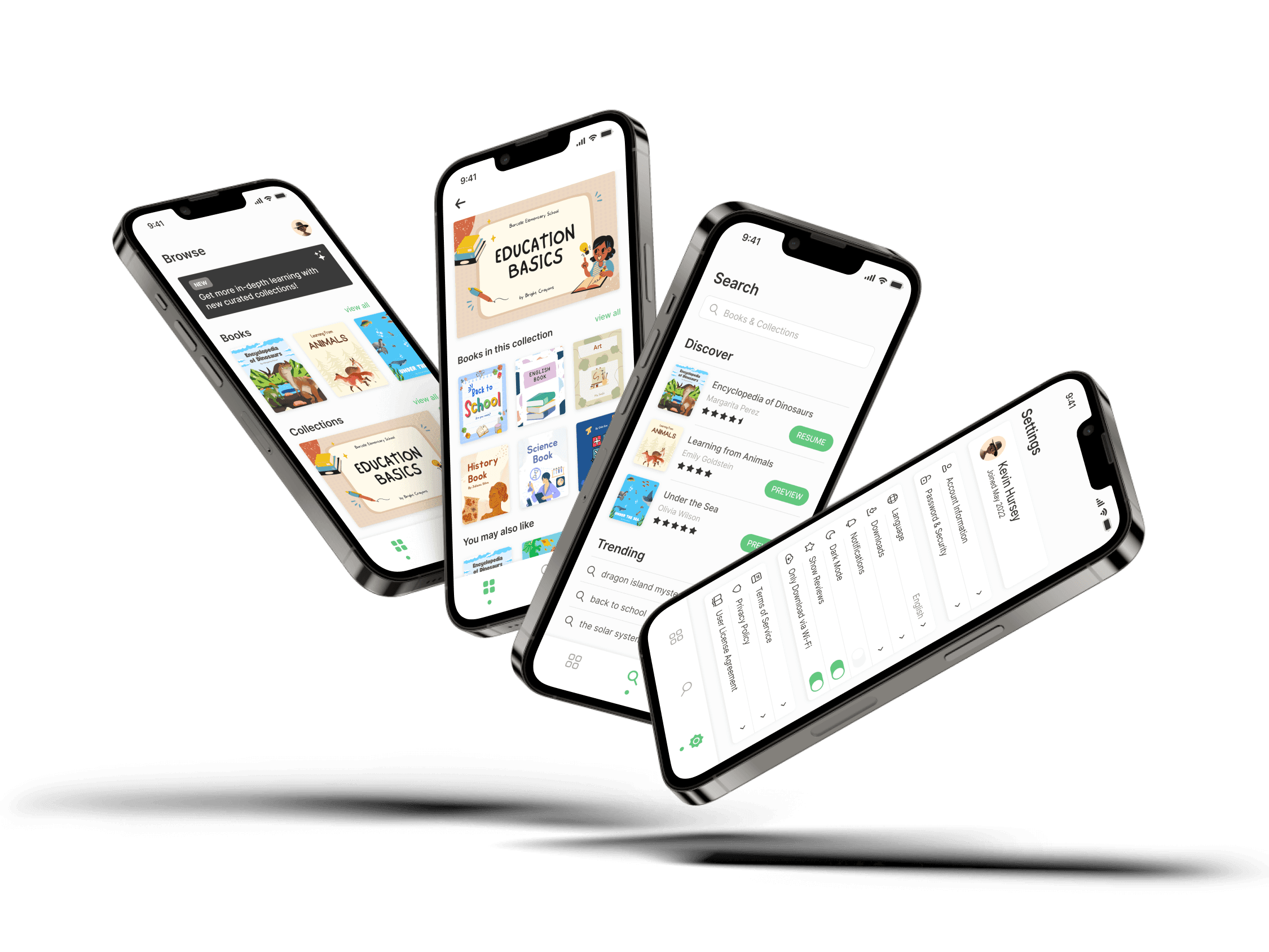
Overview
This independent student project was completed while I was in the Google UX Design Career Certificate Program. I was the sole designer on this project and was also responsible for user research, wireframing, prototyping, and branding.
Problem
Recent studies have shown that most K-12 students prefer to use technology so they can take charge of their own learning. These students want to play a more active role in their education, but they need more modern environments specifically designed for engaged teaching.
Solution
Today's students are accustomed to using the web for self-directed learning at a very young age, and they're spending their free time looking up information for themselves. The goal was to create a digital experience where children can embrace their curiosity, explore various topics, and become better learners.
Understanding the User
Before beginning the design process, I needed some additional context. My primary focus was to figure out some of the different ways students learn and what challenges they may face. I decided it was best to conduct secondary research based on time and budget constraints.
Research Findings
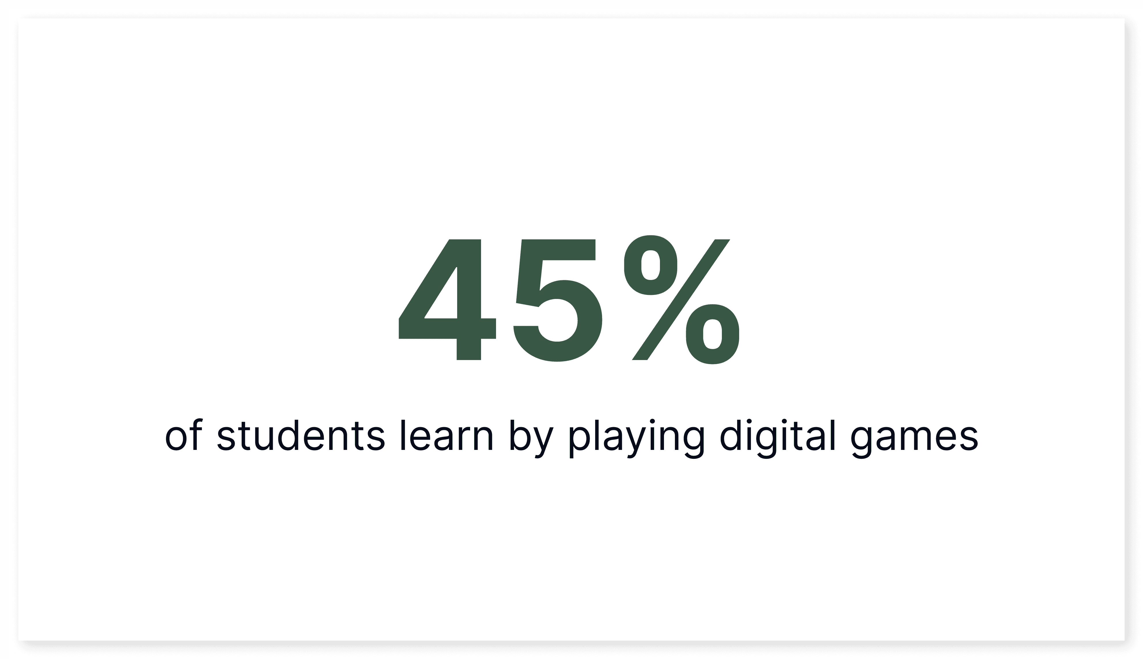
According to the annual "Speak Up" survey from the nonprofit organization Project Tomorrow, 49% of students in grades 6-12 say they regularly use YouTube for self-directed learning.
In addition, 50% of elementary students say their favorite way to learn is using technology to collaborate with others, and 75% of all students say their ideal school would give them a digital device to take charge of their learning.
Key Insights
Here are a few insights based on the information gathered in my research:
Most students seek additional learning outside of school
Most students prefer digital teaching compared to traditional methods
Most students would rather learn at their own pace with technology

Competitor Research
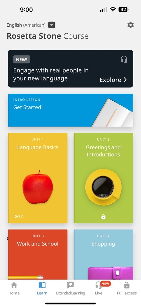
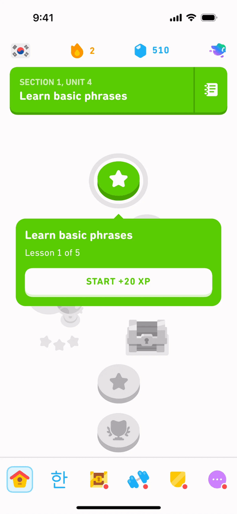
To learn a little bit more about the market, I observed and analyzed several competitors and noted some of the features they were offering their users. I studied Rosetta Stone and Duolingo, two successful digital products in the education field.
Rosetta Stone offers features like a personalized learning plan and the ability to download lessons offline.
Duolingo offers game-like lessons and the ability to track your progress to work towards your goals.



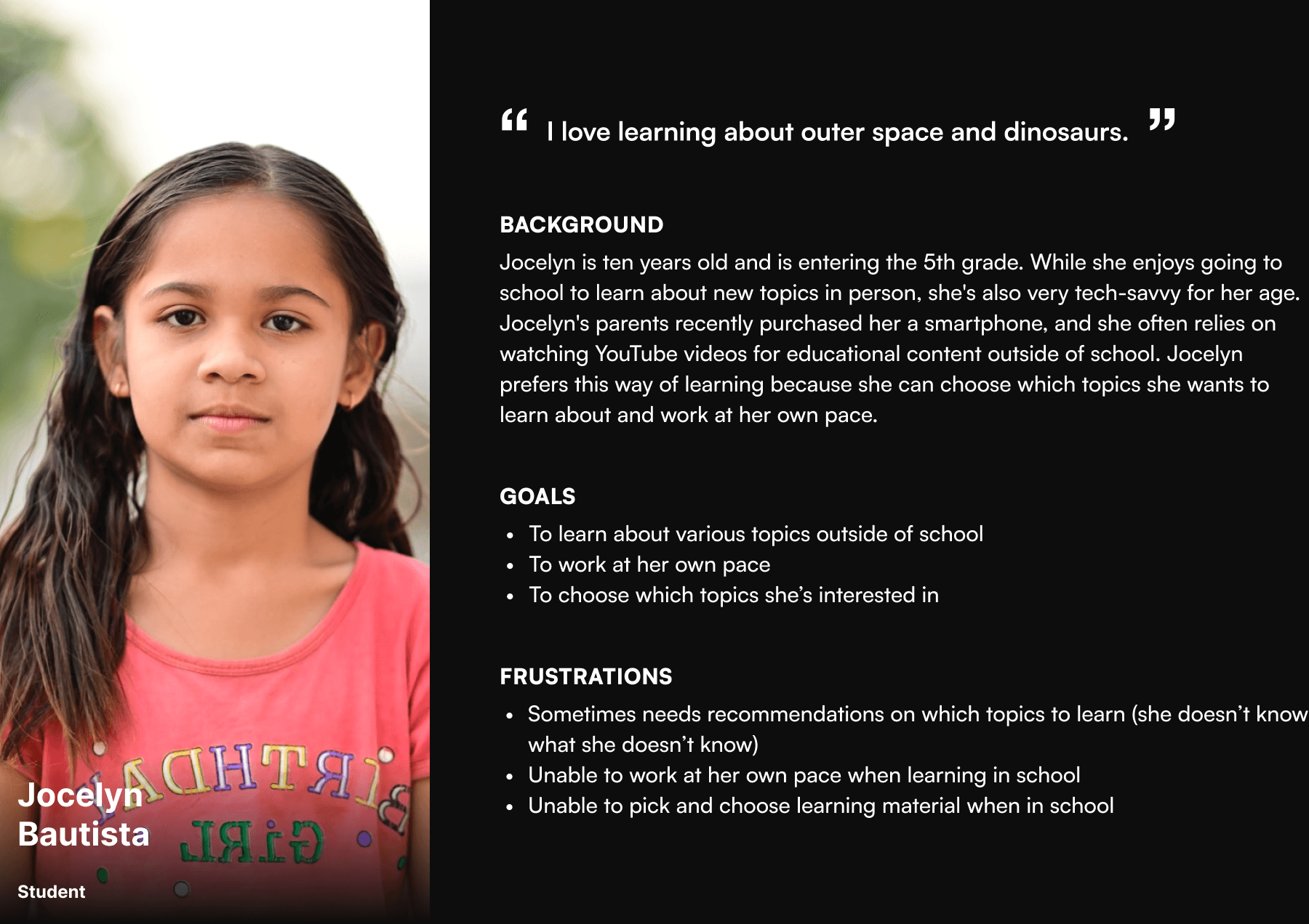
Personas
After gathering and organizing the data from my research, I needed to create a persona to visualize the target end-user. To guide me through the design process, I wanted to ensure that this persona accurately portrayed a young student eager to learn new things. This persona was referred to throughout the entire product life cycle in order to remain focused when making design decisions.
Sketches
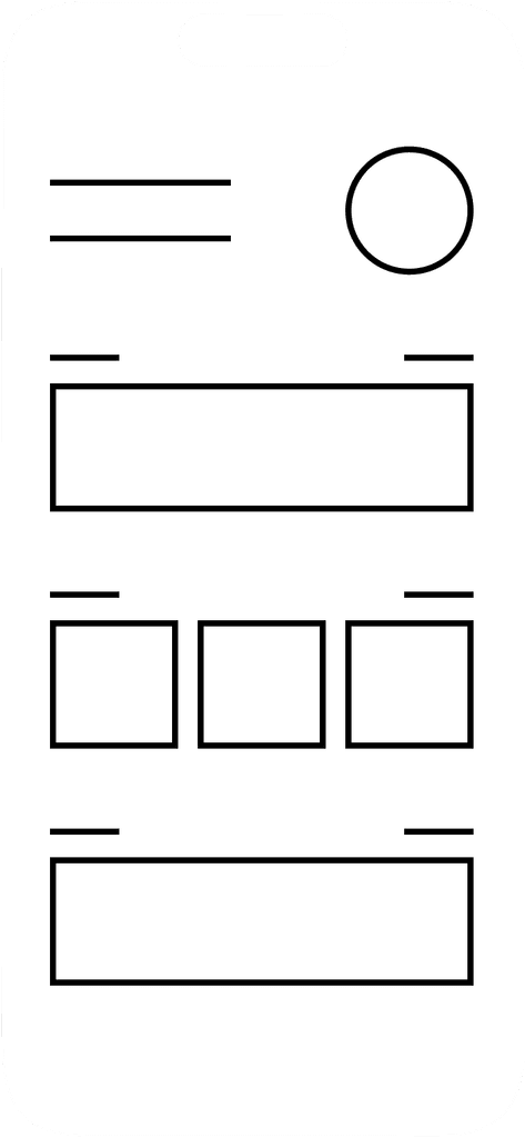
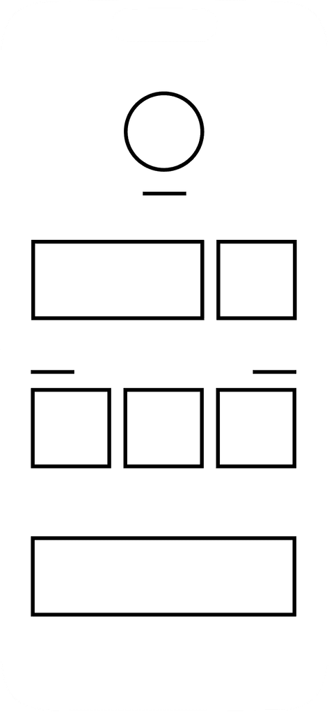
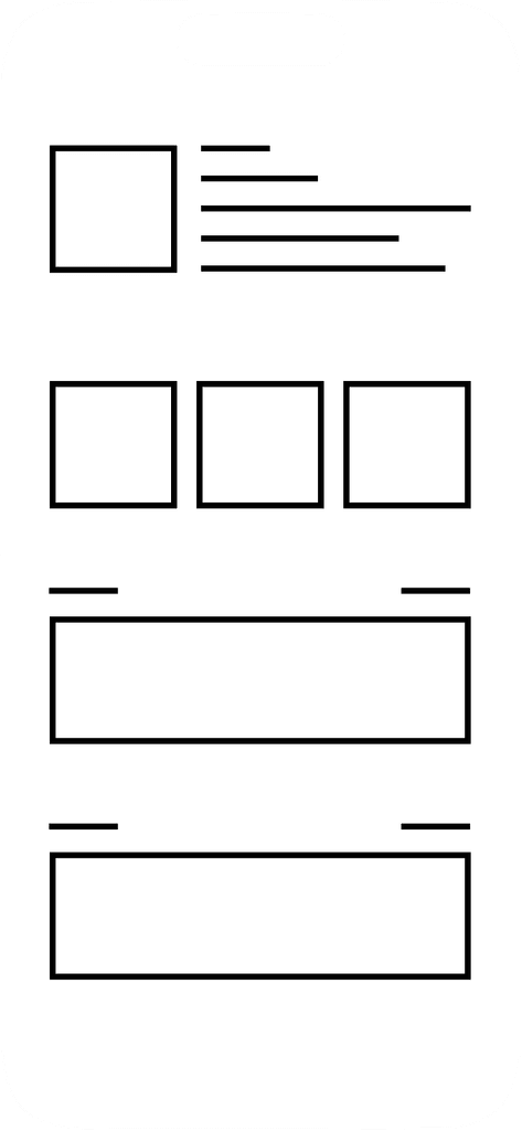
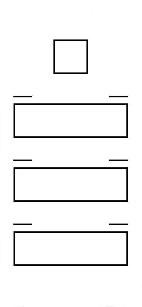
I started with several basic sketches of how I wanted the overall layout to be structured to begin the design stage. I wanted the user to select between books and collections and access their account settings all from the homepage. This was reflected in the sketches shown below.




Low-Fidelity Prototypes
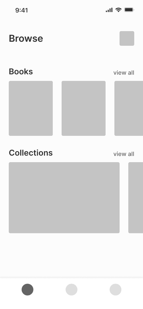
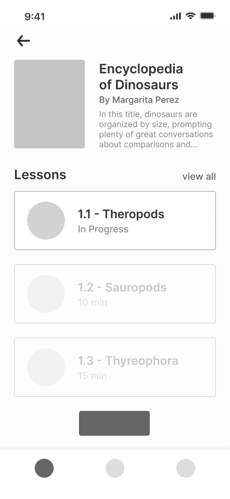
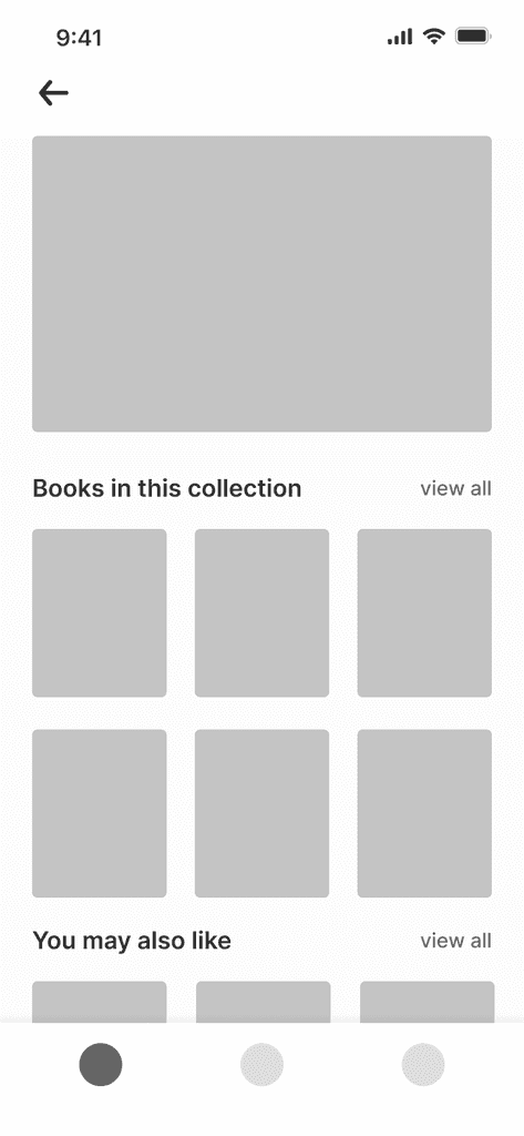
Now that the structure of the application was determined, I moved on to creating a low-fidelity prototype. This was useful when determining how enjoyable and functional the current design was during this stage.



User Testing
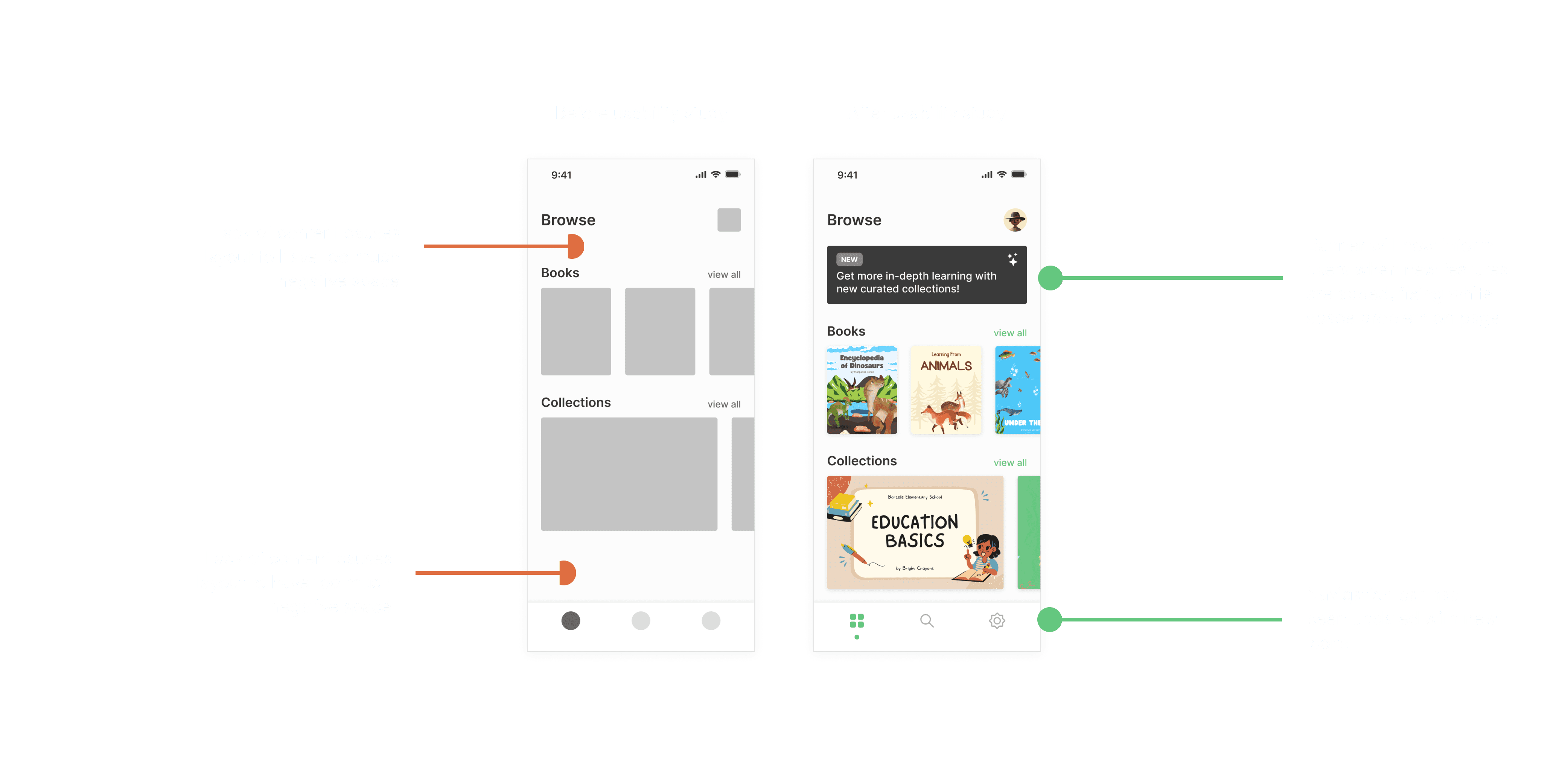
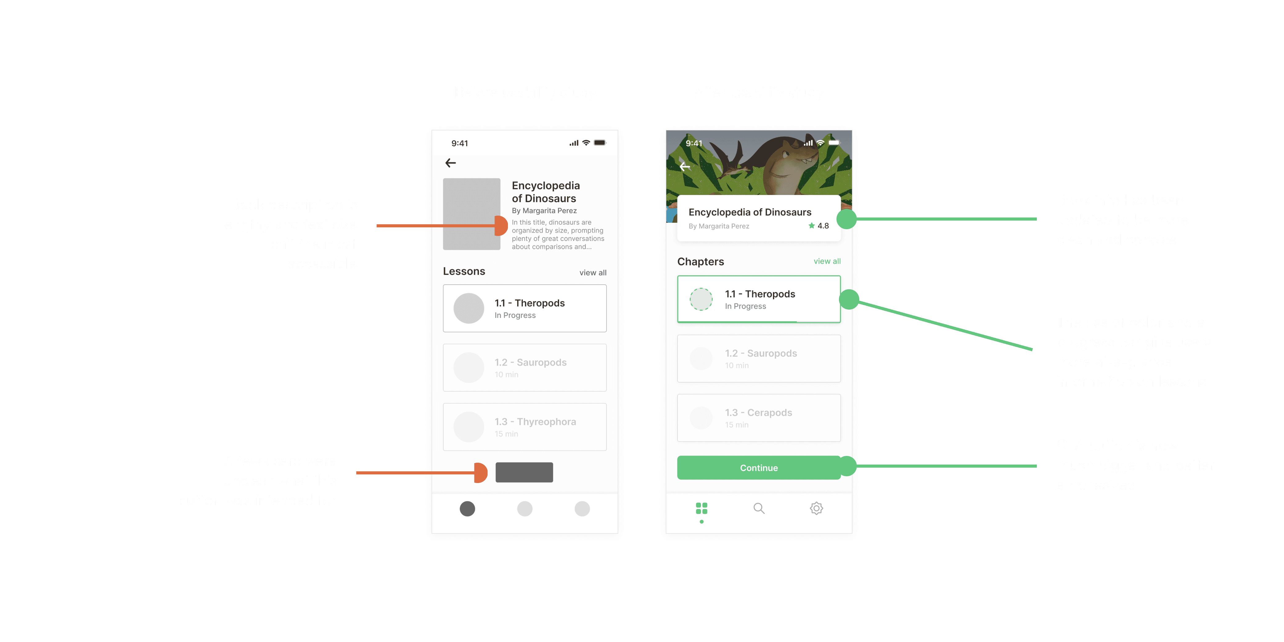
As always, I conducted user testing with several participants before finalizing my designs with high-fidelity mockups. After gathering insights from users, the following changes were made and displayed below.
Final Design
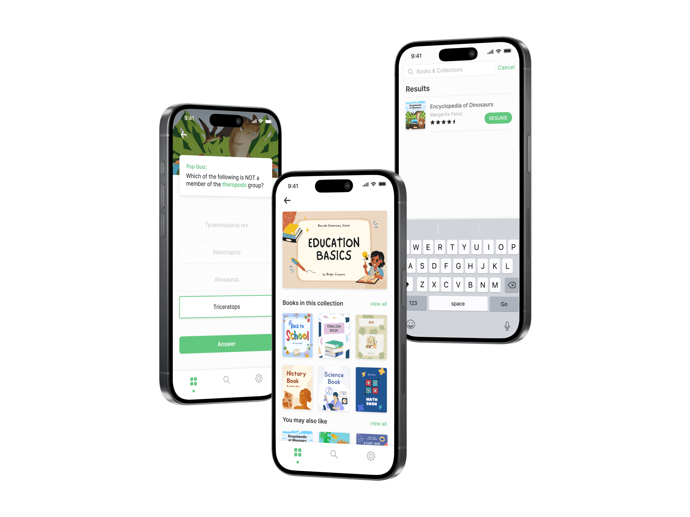
The purpose of this application was to allow young, eager students to quickly navigate and learn various topics outside of traditional schooling. With this in mind, I wanted the app to have a clean and minimal feel to ensure the design doesn't get in the way of the user's goals.


Takeaways & Next Steps
With this project, I learned about the different way students digest information and what challenges they frequently encounter. While this application is not meant to be an alternative to learning from a teacher in a physical classroom, the goal was to provide a digital experience where young students can expand on their curiosity and broaden their knowledge.
When it comes to further improving this experience, some next steps would be:
Expand the overall selection of topics
Design a flow for students to download lessons for offline learning
Implement a social aspect where students can connect with one another